An online checkout that lost three out of four shoppers — redesigned from five steps to two, documented for shoppers and support, and tested as an interactive prototype.
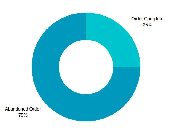
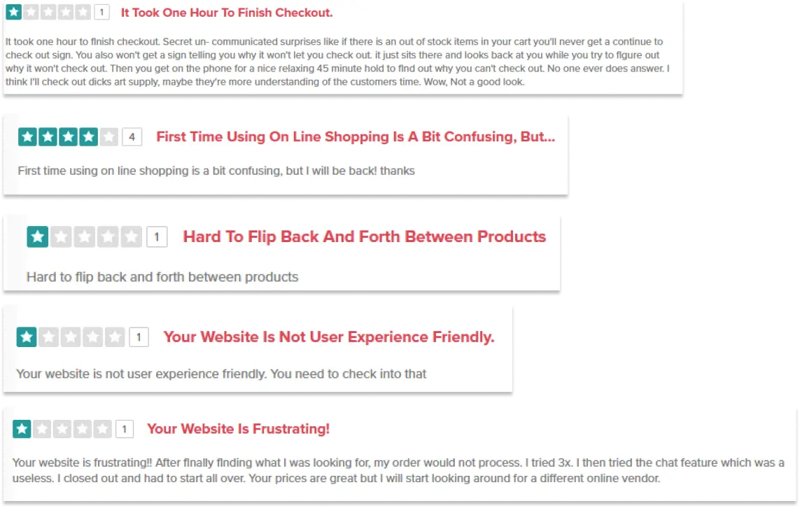
Jerry's Artarama is an art-supply retailer with more than five decades in business, but its online checkout was costing it customers: 75% of online shoppers abandoned an order in the past quarter, and reviews called checkout "too long and complicated". The redesign cut checkout from five steps to two and stopped asking shoppers to create an account first.
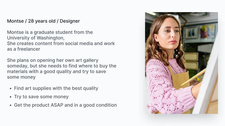
UsersMontse, a designer buying supplies for herself · John, an art instructor buying for his classes
The research, personas, wireframes, product-page designs and the 8-user test come from the original project. The two-step checkout shown here is an interactive rebuild of the redesigned flow, made for this case study so it could be documented and tested end to end.
How the project came together
1
Research & design UX/UI
Competitive analysis, real user reviews, two personas, the purchase flow, wireframes and high-fidelity designs, tested with 8 users over Zoom.
2
Design review QA
The original design files and the new checkout mock, reviewed for defects and accessibility before the build.
3
Documentation Technical Writing
Help articles for shoppers and for the support team — placing an order, bulk ordering, shipping and limits, and every checkout error.
4
Build & test UX/UIQA
An interactive two-step checkout that fixes what the review found, tested against 29 cases. Try it.
75%
Of online shoppers abandoned an order before the redesign
5 → 2
Checkout steps, with no account required
8
Users tested the original prototype
29
Test cases run against the rebuilt checkout
UX/UI
Research and design
Research & competitive analysis
The number that framed the whole project: 3 out of every 4 online shoppers left without finishing their order.
I compared Jerry's Artarama with three competitors — BLICK, Utrecht and Cheap Joe's — and read through real user reviews to find the recurring usability problems behind that number.
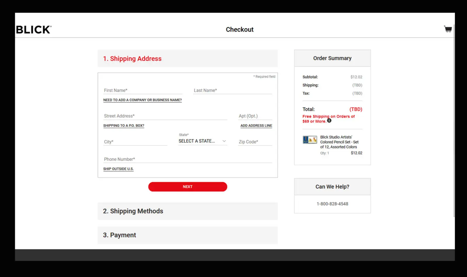
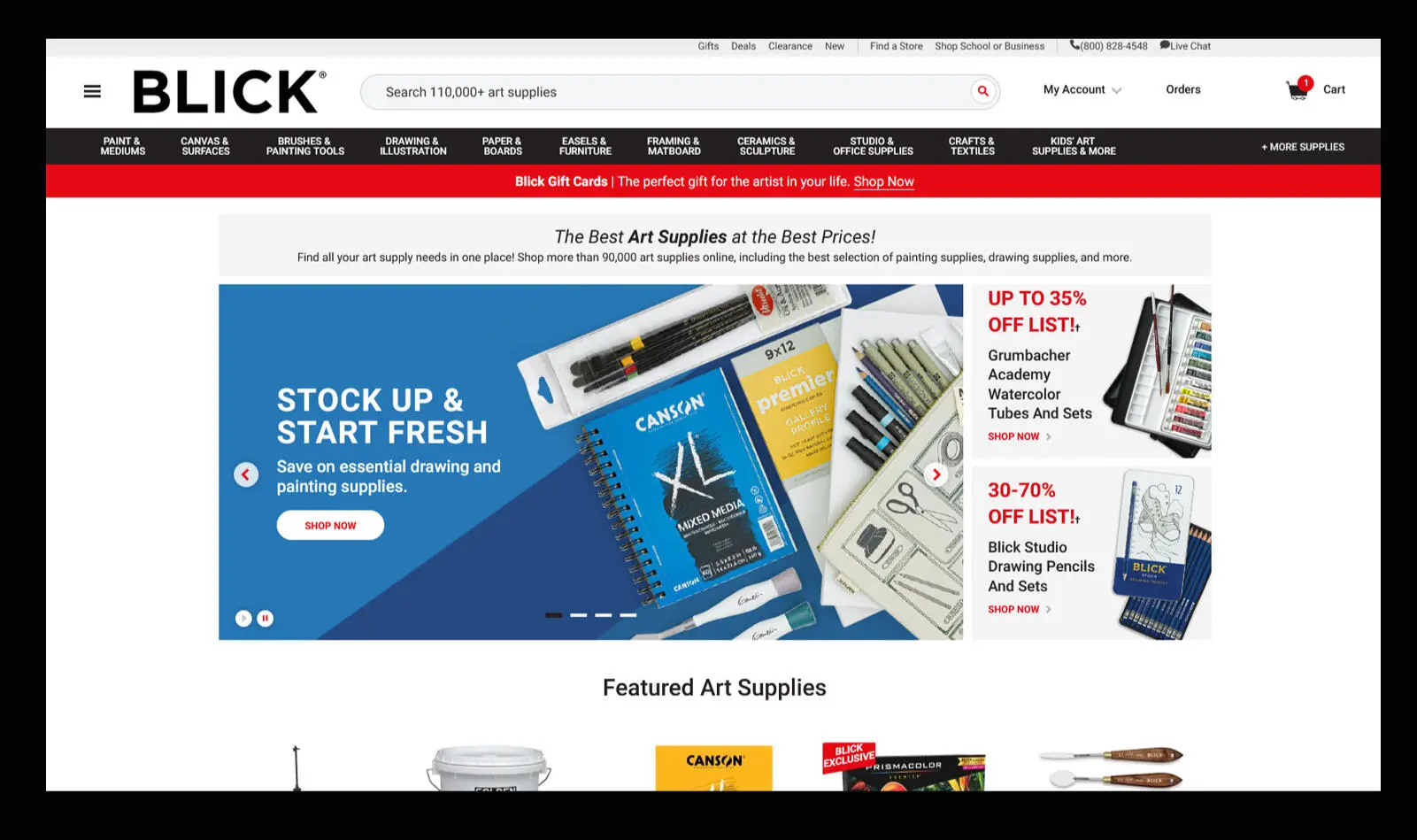
BLICK's checkout and homepage showed what a more guided, step-by-step flow could look like.
Other retailers also handled bulk quantity selection better than Jerry's did — a pattern that fed directly into the bulk-ordering table.
Personas
Two personas represented the two kinds of shoppers the redesign had to serve — and later became the two audiences of the help articles.
Montse, 28, designer — buys a few supplies for herself, compares prices and wants to finish fast.
John, 63, painter and art instructor — buys in bulk for his classes and needs clear stock and order limits.
Design process
The purchase flow came first — search, add quantity, cart, sign in, checkout, place order — to see exactly where the friction piled up. The flow put an authentication step — log in, register or continue as a guest — between the cart and checkout.
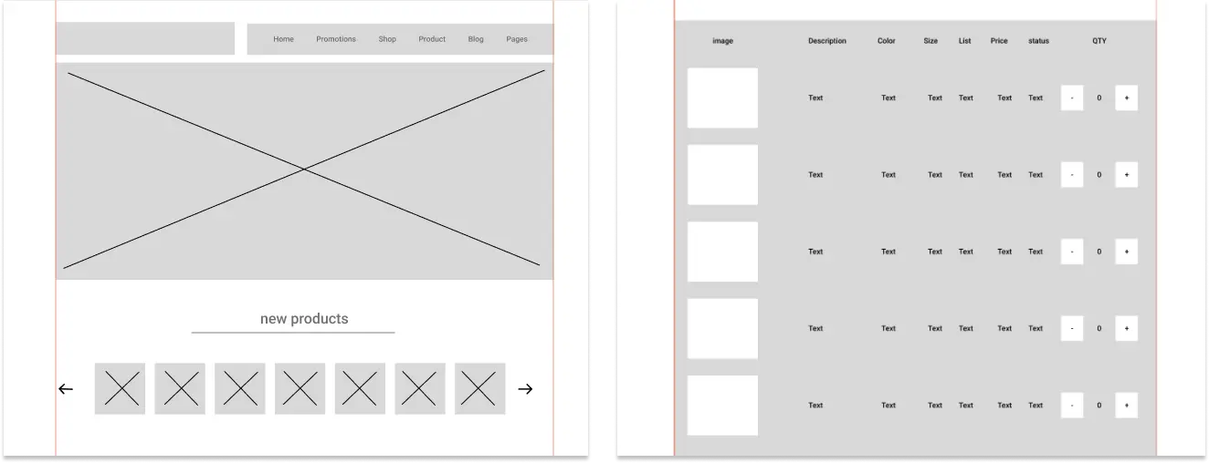
Low-fidelity wireframes locked in the homepage layout and a clearer purchase-items table with inline quantity controls.
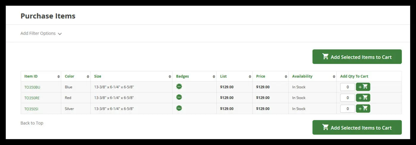
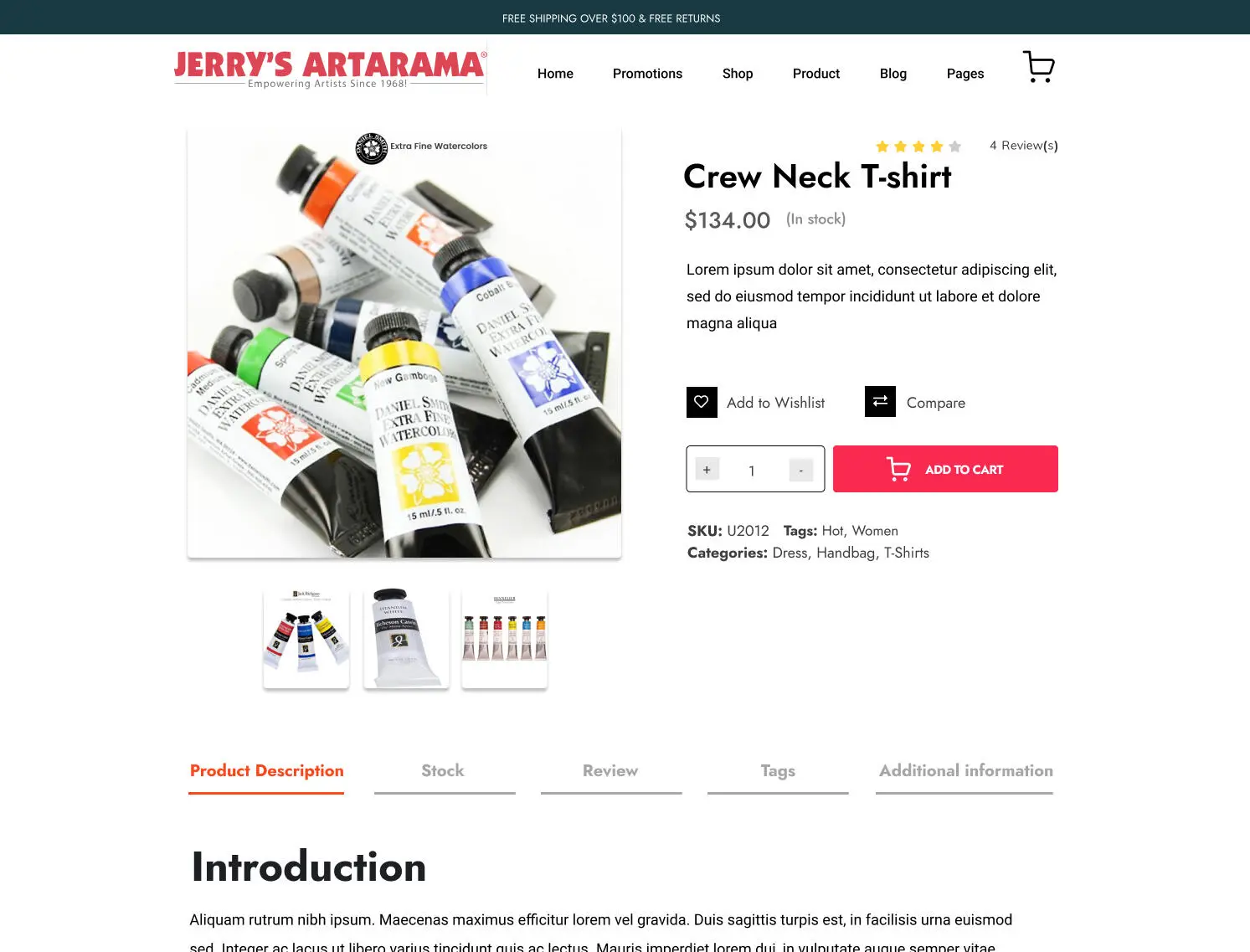
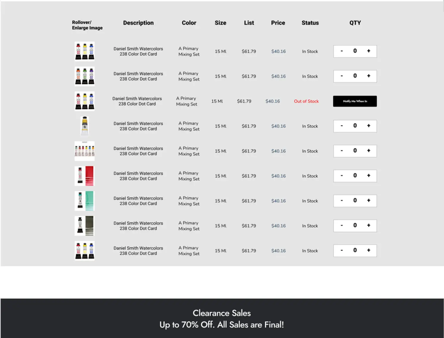
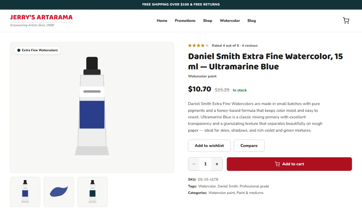
Then the high-fidelity product page and bulk table. These early-iteration designs are reviewed for defects in the QA section.
Product page — early iteration.Bulk purchase table — early iteration.
The redesigned checkout
Two steps — your details, then review — with no account required, and every screen designed for phones as well as desktops.
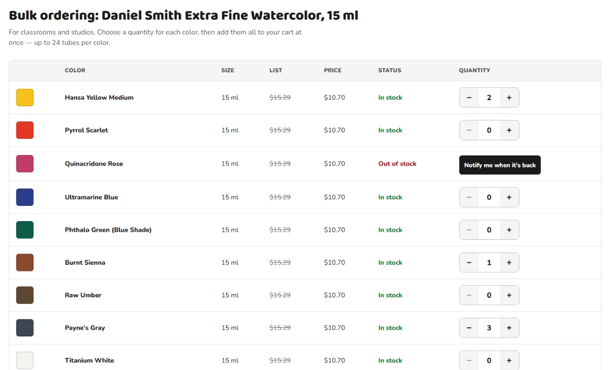
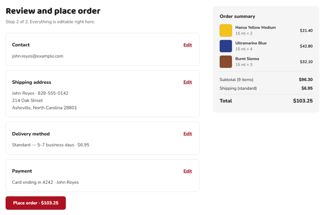
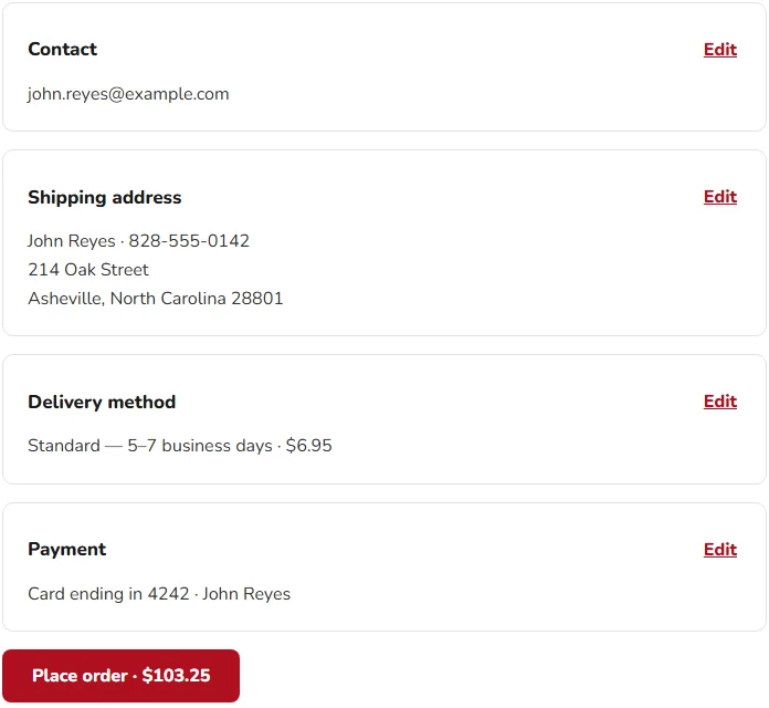
Product page, with the early iteration's defects fixed: real content, and a stepper that reads − 1 +.Bulk ordering for John: nine colors, one button, and stock visible before anything reaches the cart.Step 2: everything is editable in place, and the total is on the button.
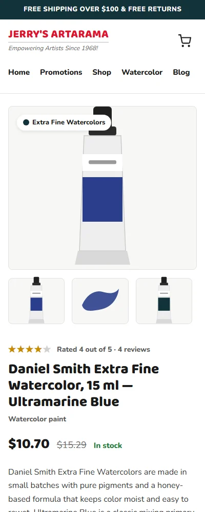
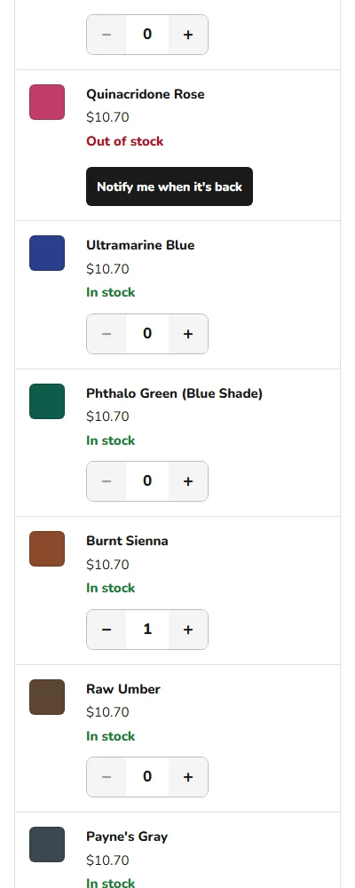
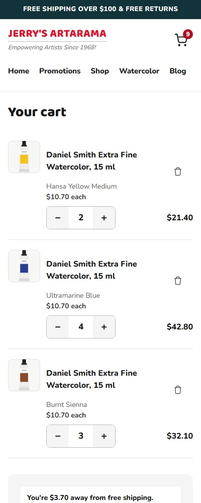
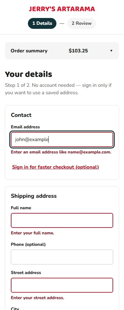
The same flow at 400 px — the order summary collapses to a single line, and the bulk table becomes one card per color.
Design decisions
1
Two steps, and no account required
The old flow made shoppers sign in before checkout. Now an email address is enough; signing in is offered as a shortcut to a saved address, never as a gate.
2
Fix anything without going back
On the review step, every block has its own Edit. A typo in the ZIP code costs one field, not a trip back through the checkout.
3
The total is on the button
"Place order · $103.25" — the last thing a shopper reads before paying is exactly what they'll pay.
4
Show the free-shipping gap
"You're $3.70 away from free shipping" turns a hidden rule into a reason to add one more tube — and it counts promo discounts, so it's never wrong.
5
A bulk table for John
Nine colors, one quantity each, one button that says how many tubes it will add. Ordering for a class takes one screen instead of nine product pages.
6
Problems surface before payment
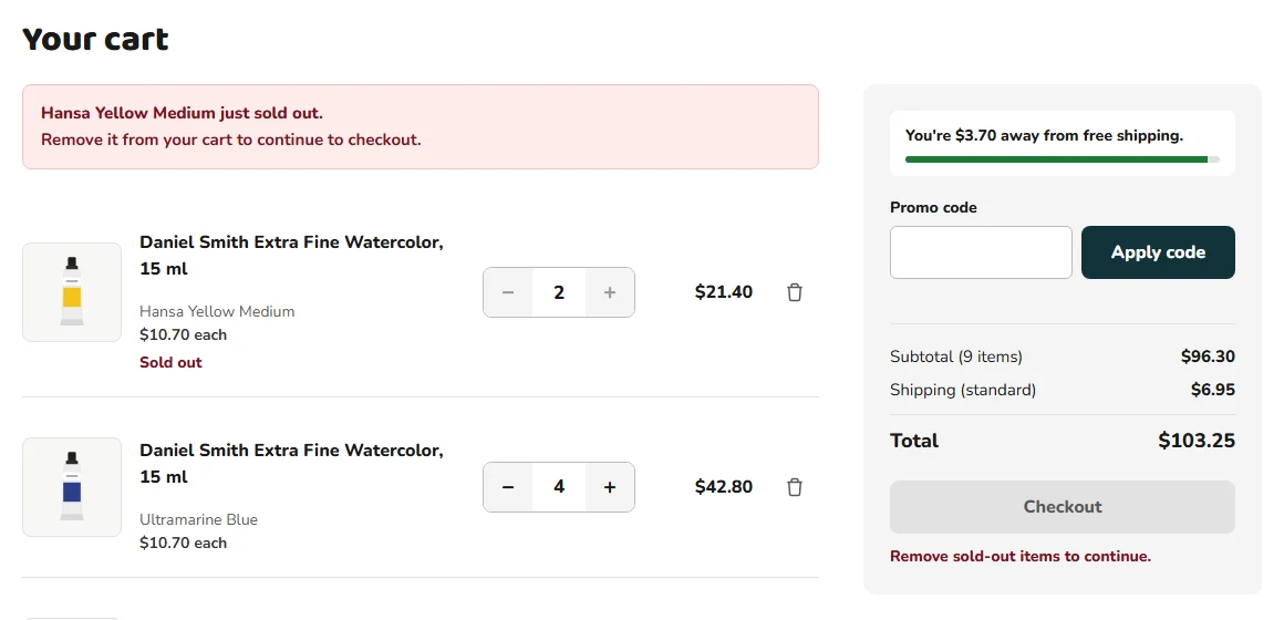
A sold-out item is flagged in the cart with the fix next to it. The shopper never reaches the payment step to discover the order can't go through.
7
Limits are explained where they apply
The 24-tubes-per-color limit shows up on the stepper that hits it, and counts what's already in the cart.
8
Accessible by default
Every text and control meets WCAG AA contrast, every control is at least 44 px tall, and every field has a visible label — measured, not assumed.
Validation
The original high-fidelity prototype was tested with 8 users over Zoom, and they completed the purchase tasks with the redesigned flow. The rebuilt two-step checkout hasn't been tested with shoppers yet; it was validated against 29 test cases.
A shorter checkout still raises questions: what counts toward free shipping, why a card was declined, why a color can't be added. The help articles answer them for the two personas, and give the support team the exact messages shoppers see.
The samples below are excerpts. Each one opens with a short note on who it's for and why it's written the way it is.
Documentation plan
Audiences
Audience
Who
What they need from the docs
Shopper
Montse, buying for herself
Finish an order quickly, as a guest or signed in, and understand shipping costs.
Bulk buyer
John, buying for a class
Order many colors at once and know the limits before hitting them.
Support
The customer service team
The exact message a shopper saw, what caused it, and what to tell them.
Every step was performed in the working prototype, and every message in these articles is copied from the screen. The test cases check the same text, so the documentation and the product can't drift apart without a test failing.
Sample 1 · One task, two ways to check out
Audience
Shopper
Type
Task
Why it's written this way
Guests and signed-in shoppers follow the same checkout with two differences, so it's one topic with two condition tags instead of two articles that drift apart. Guest checkout comes first, because the redesign made it the default.
Show this topic for
Jerry's Artarama Help › Ordering
Place an order
Checkout has two steps: your details, and a review of your order.
In your cart, select Checkout.
Under Contact, enter your email address.
Guest
You don't need an account. Continue with the next step.
Signed in
Select Sign in for faster checkout (optional), enter your email address and password, and select Sign in. Your saved address fills in.
Guest
Under Shipping address, enter your name, street address, city, state and ZIP code. Your phone number is optional.
Signed in
Under Shipping address, check the address that filled in, and change it if you're shipping somewhere else.
Under Delivery method, choose Standard or Express.
Under Payment, enter your card details, and then select Continue to review.
Check your order. To change something, select Edit next to it, make the change, and then select Save.
Select Place order. The button shows your total.
Result: A confirmation page shows your order number and when your order should arrive, and a confirmation is sent to your email address.
Tip Standard shipping is free when your items total $100 or more after promo codes. Your cart shows how far you are from it.
Sample 2 · A task for bulk buyers
Audience
Bulk buyer
Type
Task
Why it's written this way
John buys for a class and will hit the limits, so they're stated before the steps, not discovered at the last one. Every label is written exactly as the screen shows it, including the button whose text changes with the count.
Jerry's Artarama Help › Ordering
Order several colors at once
Use bulk ordering to choose quantities for several colors of the same paint and add them to your cart together.
Before you start You can order up to 24 tubes of each color. Tubes already in your cart count toward the limit.
On the product page, select View bulk ordering.
For each color you want, select + until the quantity is right. The button at the bottom updates as you go — for example, Add 12 tubes to cart.
Select the button to add everything at once. A confirmation appears with a link to your cart.
Note A color marked Out of stock can't be added. Select Notify me when it's back to be told when it returns.
Sample 3 · Reference
Audience
Shopper · Support
Type
Reference
Why it's written this way
Shipping costs and promo rules are looked up, not read, so each rule is one row. The detail support gets asked about most — that free shipping counts the discounted total — is stated in the table itself, not left for a footnote.
Jerry's Artarama Help › Reference
Shipping, promo codes and limits
Delivery methods
Method
Arrives in
Cost
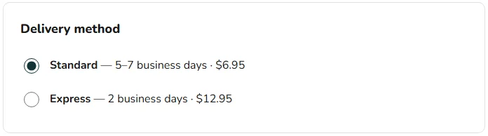
Standard
5–7 business days
$6.95, or free when your items total $100 or more after promo codes
Express
2 business days
$12.95. Free shipping doesn't apply.
Promo codes
Rule
Details
One per order
To use a different code, select Remove first.
Items only
The discount applies to your items, not to shipping.
Not case sensitive
welcome10 and WELCOME10 are the same code.
Order limits
Limit
Details
24 tubes per color
Counts the tubes already in your cart.
Out of stock
Out-of-stock colors can't be added. If a color sells out while it's in your cart, remove it to continue to checkout.
Sample 4 · Troubleshooting
Audience
Shopper · Support
Type
Troubleshooting
Why it's written this way
Each problem is titled with the exact message on screen, so a shopper can search for what they see and a support agent can match what a customer reads to them. Every entry says why it happened and what to do next.
Jerry's Artarama Help › Troubleshooting
Fix a checkout problem
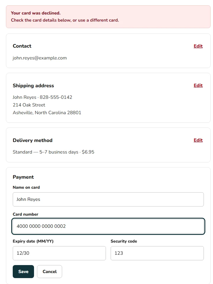
“Your card was declined.”
Why it happens: The card's issuer didn't approve the payment.
What to do: The payment details open right below the message. Check them, or enter a different card, and then select Save and Place order again. Your other details stay as they are.
“This card has expired. Use a different card.”
Why it happens: The expiry date is earlier than the current month.
What to do: Check the date on the card, written as MM/YY. If it's right, use a different card.
“That code isn't valid.” or “This promo code has expired.”
Why it happens: The code has a typo, or its offer has ended.
What to do: Check the spelling. An expired code can't be used again.
“[Color] just sold out.”
Why it happens: The color sold out after you added it to your cart.
What to do: Select the remove button next to it. Checkout becomes available again.
“You already have the maximum of 24 tubes of this color in your cart.”
Why it happens: Each color is limited to 24 tubes per order, including what's already in your cart.
What to do: Keep this color at 24 tubes or fewer for this order.
I added a promo code and lost free shipping
Why it happens: Free shipping counts your items after the discount. A $107.00 order with 10% off becomes $96.30 — under $100.
What to do: Your cart shows how much more you need. Add items until it says you qualify.
UX writing: before and after
The copy in the checkout mock was reviewed with the same care as the articles. Each change is one less thing a shopper has to ask support about.
Where
Before
Final
Why
Sold-out item
Remove it to check out, or we'll cancel it from your order automatically.
Hansa Yellow Medium just sold out. Remove it from your cart to continue to checkout.
The old message promised an automatic cancellation that never happened — checkout was simply blocked. It also didn't say which item.
Card number
Enter a valid card number.
Enter your card number. · Enter the card number using digits only. · That card number isn't valid. Check it and try again.
Three causes, three messages, each saying what to do.
Expired promo
A message with a fixed expiry date
This promo code has expired.
A date written into the screen goes stale; the shopper only needs to know the code no longer works.
Step 1 intro
Step 1 of 2 — we just need your contact, shipping and payment info.
Step 1 of 2. No account needed — sign in only if you want to use a saved address.
Answers the question that made shoppers leave the old flow.
Product title
Crew Neck T-shirt
Daniel Smith Extra Fine Watercolor, 15 ml — Ultramarine Blue
The early iteration carried template text. A product page has to name the product.
Bulk button
Add 12 items to cart
Add 12 tubes to cart
Tubes are what John is counting; "items" is the store's word, not his.
Test card hint
Try 4242 4242 4242 4242 to continue… (inside the payment form)
(moved to the prototype guide)
Instructions for testers don't belong in front of shoppers.
How the error messages are written
One cause, one message — "Enter a ZIP code with 5 digits.", not "Invalid input."
Say what to do next, and never blame the shopper.
Show it next to its field, link it to the field for screen readers, and move focus to the first one.
Count what's left — "Check 3 fields above." tells the shopper how close they are.
Style conventions
The articles follow the Microsoft Writing Style Guide:
Second person, present tense, active voice.
Select instead of "click", so the steps work on a phone, a mouse or a keyboard.
Interface labels in bold, spelled exactly as they appear on screen.
Messages quoted word for word, so they can be searched.
One action per step, with the result right after it.
QA
Review and testing
Jerry's Artarama was reviewed three times: the original design files, the new checkout's design mock before it was built, and the working prototype against 29 test cases.
Almost every defect below is in the project's own work — the early iteration, the mock and the prototype's code. Each one is fixed and retested, except one in a screen that wasn't rebuilt, which stays open and says so.
Test plan
Objective
Make sure a shopper can buy — as a guest or signed in, one tube or a whole class set — with correct totals, clear errors and no dead ends, on a phone or a desktop, and that every screen meets WCAG AA.
Scope
In scope
Product page, bulk ordering, cart and the two checkout steps
Totals: promo codes, the free-shipping threshold, delivery methods
Validation, declined cards, sold-out items and order limits
Accessibility of every screen, at 1440 and 400 px
Out of scope
Real payment processing and order history — the prototype places no orders
The homepage and search — not part of the rebuilt flow
Browsers other than Chrome
Performance and load
Approach
Pass
What was reviewed
How
1 · Design review
The early-iteration design files
Content and consistency checks against each persona's tasks
2 · Design review
The checkout design mock
Every interaction walked through; copy checked against what the screen actually does
3 · Accessibility audit
The mock and the prototype
Contrast measured with the WCAG 2.1 formula, axe-core on 12 states, target size, keyboard and focus
4 · Functional testing
The interactive prototype
29 test cases: boundary values, equivalence partitioning, state transitions and negative tests
Environment: Chrome (latest), Windows 11, 1440 × 900 and 400 px · axe-core 4.10.
Risks, in priority order
Risk
Why it matters
Covered by
High A total is wrong
It's money — a wrong discount or shipping charge breaks trust at the last step
TC11–TC13, TC21, TC26, TC29
High A shopper can't finish checkout
Abandonment is the problem the redesign exists to solve
TC17–TC25
Medium Limits and stock surprise the shopper
John orders dozens of tubes; a silent cap loses his order
TC06–TC10, TC15, TC16
Medium A screen can't be used with a keyboard, touch or low vision
Every High-risk case passes, no High-severity defect stays open, and axe-core reports zero violations. All three were met.
Defects found — 18, 17 fixed
Five in the early-iteration designs, eleven in the checkout mock, two in the prototype. Each report says where it was found, what was expected, what happened, and how it was fixed and verified.
Early iteration
E-01 · [Product page] A watercolor is titled “Crew Neck T-shirt”
Found in: design review · early iteration
Severity: MediumPriority: HighFixed
ExpectedThe title, tags and categories describe the product in the photo.
ActualTitle "Crew Neck T-shirt", tags "Hot, Women", categories "Dress, Handbag, T-Shirts" — on a page selling watercolor paint.
Early iterationFixed
Fix: Real title, tags, categories and SKU. Verified by TC01.
E-02 · [Product page] The description is lorem ipsum
Found in: design review · early iteration
Severity: MediumPriority: MediumFixed
ExpectedA description a shopper can use to decide.
ActualPlaceholder Latin in the summary and in the "Introduction" section, visible in the screen above.
Fix: Real product copy, and a tab with the details a painter checks: pigment, lightfastness, transparency. Verified by TC01.
E-03 · [Product page] The quantity stepper is reversed
Found in: design review · early iteration
Severity: MediumPriority: MediumFixed
Expected− on the left, + on the right — the convention shoppers already know.
Actual+ on the left and − on the right, so the first tap often does the opposite.
Fix: − 1 +, with − disabled at 1. Verified by TC02.
E-04 · [Bulk table] The same product fills all nine rows
Found in: design review · early iteration
Severity: MediumPriority: HighFixed
ExpectedEach row is a different color John can choose.
Actual"Daniel Smith Watercolors 238 Color Dot Card, A Primary Mixing Set" repeats in every row, with different pictures.
Early iterationFixed
Fix: Nine distinct colors with swatches, and one out of stock to show that state. Verified by TC07.
E-05 · [Homepage] The headline reads “Profesional Artist Tools”
Found in: design review · early iteration
Severity: LowPriority: MediumOpen · not in the rebuilt flow
Expected"Professional".
Actual"Profesional", in the largest text on the homepage.
Status: The homepage wasn't rebuilt, so this stays open and reported rather than marked fixed.
Checkout design mock
D-01 · [Review] “Edit” on Contact does nothing
Found in: design review · checkout mock
Severity: HighPriority: HighFixed
Reach step 2 and select Edit next to Contact.
ExpectedThe email address becomes editable.
ActualNothing visible changes. A shopper with a typo in their email can't fix it without starting over.
Fix: Every block opens an inline form. Verified by TC23.
D-02 · [Review] Edit fields have no labels, and the address saves empty
Found in: accessibility audit · checkout mock
Severity: HighPriority: HighFixed
ExpectedLabeled fields, validated with the same rules as step 1.
ActualUnlabeled inputs, no state field, and Save accepts an empty street address.
Fix: The same labeled fields and rules as step 1; Cancel restores the old values and returns focus to Edit. Verified by TC23 and TC24.
D-03 · [Review] After a declined card, focus goes nowhere
Found in: design review · checkout mock
Severity: MediumPriority: HighFixed
ExpectedFocus moves to the card number, next to the error.
ActualThe code focuses a field that only exists on step 1, so a keyboard user stays on the Place order button with no idea what went wrong.
Fixed
Fix: The payment block opens and the card number receives focus, described by the alert. Verified by TC25.
D-04 · [Payment] Impossible card data passes validation
Found in: design review · checkout mock
Severity: MediumPriority: MediumFixed
ExpectedMonth 13, a past date or a mistyped number are caught before the review step.
ActualExpiry checked the format only, so "13/99" and last year's dates passed; any 13–19 digits passed as a card number.
Fix: Month and expiry checks, a checksum on the card number, and a specific message for each. Verified by TC19.
D-05 · [Cart] The sold-out message promises something that doesn't happen
Found in: design review · checkout mock
Severity: MediumPriority: MediumFixed
ExpectedThe message matches what the store does.
Actual"We'll cancel it from your order automatically" — while the Checkout button is disabled, with no reason given next to it.
Fixed
Fix: The alert names the item and the fix, and the disabled button explains itself. Verified by TC15 and TC16.
D-06 · [Limits] The 24-per-color limit only exists in the bulk table
Found in: design review · checkout mock
Severity: MediumPriority: MediumFixed
ExpectedOne limit, enforced everywhere, counting what's already in the cart.
ActualThe product page and the cart let the quantity go past 24.
Fix: One shared limit, with a message on the control that reaches it. Verified by TC06 and TC10.
D-07 · [Content] Dates are written into the screens
Found in: design review · checkout mock
Severity: MediumPriority: MediumFixed
ExpectedDelivery estimates calculated from the order date.
ActualThe confirmation always showed the same delivery day, and the expired-promo message named a fixed date — both wrong within weeks.
Fix: The estimate counts business days from today; the promo message doesn't need a date. Verified by TC12 and TC26.
D-08 · [Mobile] There is no phone layout
Found in: design review · checkout mock
Severity: HighPriority: HighFixed
ExpectedEvery screen at 390 px, as the brief asked.
ActualFixed desktop grids, with no layout for narrow screens.
Fix: Single-column layouts, a collapsible order summary, and the bulk table as one card per color. Verified in the 400 px screenshots above.
D-09 · [Accessibility] Controls smaller than 44 px
Found in: accessibility audit · checkout mock
Severity: MediumPriority: MediumFixed
ExpectedEvery control at least 44 px tall, as the brief required.
ActualBulk and cart steppers 36 × 40 px, "Notify me" and the Edit links 32 px, Save 40 px.
Fix: Every control resized. Full numbers in the accessibility audit; verified by TC28, which measures them.
D-10 · [Accessibility] Three text colors fail WCAG AA
Found in: accessibility audit · checkout mock
Severity: MediumPriority: MediumFixed
ExpectedText at 4.5:1 or more.
ActualThe list price, the placeholders and the helper text under the card field measure 3.45:1.
Fix: Darker grays. Every pair now measures 4.88:1 or more.
D-11 · [Product & content] Tabs that aren't tabs, dead links, and test tools in the store
Found in: design review · checkout mock
Severity: LowPriority: MediumFixed
ExpectedControls that do what they look like they do, and nothing for testers in front of shoppers.
ActualFive product tabs that couldn't be selected, menu links to #, and a "Preview states" panel and test-card hints inside the store.
Fix: Working, keyboard-operable tabs; links outside the prototype say so; test tools moved to the prototype guide. Verified by TC04 and TC05.
Prototype
P-01 · [Mobile] The “Delivery method” heading sits on its card's border
Found in: screenshot review at 400 px · prototype
Severity: LowPriority: LowFixed
ExpectedThe heading inside the card, like every other section.
ActualA fieldset legend renders on the border line by default.
Fix: The legend is laid out inside the card. Verified in the 400 px screenshots.
P-02 · [Cart] An Express choice from the last order is charged on the next cart
Found in: functional testing · prototype · TC29 failed on its first run
Severity: MediumPriority: HighFixed
Place an order with Express delivery.
Add $96.30 of paint to a new cart.
ExpectedStandard shipping, $6.95, and "You're $3.70 away from free shipping."
Actual$12.95 Express shipping — next to a free-shipping message that Express can never qualify for.
Cause and fix: The delivery method and card details weren't reset after an order, and the cart used the checkout's delivery choice. Both now reset after every order — a card is never reused — and the cart always estimates Standard shipping, labeled as such. Verified by TC29, the boundary test that found it.
Accessibility audit
Contrast, measured
Every ratio is calculated with the WCAG 2.1 formula from the actual color values. AA requires 4.5:1 for normal text.
Element
Mock
Prototype
List price
3.45:1
5.33:1
Placeholders
3.45:1
4.95:1
Helper text under the card field
3.45:1
Moved out of the store
Field error messages
7.14:1
10.78:1
White text on the red buttons
7.14:1
7.14:1
Secondary text
7.00:1
7.00:1
Logo
4.88:1
4.88:1
Target size
Control
Mock
Prototype
Bulk and cart quantity steppers
36 × 40 px
44 × 44 px
Notify me when it's back
32 px tall
44 px
Edit links on the review
32 px tall
44 px
Save buttons on the review
40 px tall
44 px
Automated scan (axe-core)
Zero violations in all 12 states scanned: product page, product with the confirmation, bulk ordering, cart with a promo error, cart with a sold-out item, step 1 with field errors, step 1 with sign-in open, review, review while editing, review after a declined card, confirmation, and the empty cart.
Keyboard and focus
Every action is a native button, link, input or select, with a visible focus ring.
Step 1 errors move focus to the first field that needs attention (TC18).
Opening an Edit form focuses its first field; saving or canceling returns focus to Edit (TC23, TC24).
A declined card moves focus to the card number (TC25).
The product tabs follow the tab pattern: arrow keys move between them (TC04).
Changing a quantity never drops focus, even when a button becomes disabled (TC14).
Test cases — 29 run, 29 passed
29
Test cases executed
29
Passed
1
Defect found during execution — fixed and retested
0
axe-core violations
Product page 6 cases
ID
Test
Technique
Expected result
Result
TC01
Product content
Positive
Real title, $10.70, "Regular price $15.29" for screen readers, In stock, "Rated 4 out of 5"
Pass
TC02
Stepper order
Usability
Reads − 1 +, with − disabled
Pass
TC03
Add to cart
State transition
Badge shows 2; confirmation offers View cart and Continue shopping
Pass
TC04
Product tabs with the keyboard
Accessibility
Arrow key moves to Additional information and shows its panel
Pass
TC05
A link outside the prototype
Usability
Says the page isn't part of the prototype instead of doing nothing
Pass
TC06
Order limit on the product page
Boundary values
With 2 in the cart, the stepper stops at 22; at 24, Add to cart is disabled with a message
Pass
Bulk ordering 4 cases
ID
Test
Technique
Expected result
Result
TC07
The color list
Equivalence partitioning
9 different colors; Quinacridone Rose out of stock with Notify me
Pass
TC08
Nothing selected, then three tubes
Boundary values
Disabled at 0; then "Add 3 tubes to cart" and "3 tubes selected · $32.10"
Pass
TC09
Notify me
State transition
"You're on the list", and it can't be sent twice
Pass
TC10
Add the selection; a color at its limit
Boundary values
Badge 27, selection resets; a color with 24 in the cart can't be raised
Pass
Cart and totals 7 cases
ID
Test
Technique
Expected result
Result
TC11
Cart totals
Positive
3 lines, $288.90, free shipping
Pass
TC12
Promo codes
Equivalence partitioning
Invalid, expired and valid codes each get their message; WELCOME10 takes $28.89 off; Remove works
Pass
TC13
Remove a line
State transition
Totals update; under $100 shows "$67.90 away from free shipping" and $6.95
Pass
TC14
Lower a quantity to 1
Boundary values
− disables and focus moves to +
Pass
TC15
An item sells out
Negative
The alert names it; Checkout is disabled with the reason
Pass
TC16
Remove the sold-out item
State transition
Checkout is available again
Pass
TC29
Free-shipping threshold
Boundary values
$96.30 pays $6.95; $107.00 ships free; with 10% off it drops back under $100
Pass Failed first run → P-02
Checkout, step 1 6 cases
ID
Test
Technique
Expected result
Result
TC17
Open checkout
Positive
Step 1 marked current; order summary visible
Pass
TC18
Submit an empty form
Negative
10 field errors, focus on email, "Check 10 fields above."
Pass
TC19
ZIP, card number and expiry
Boundary values
4-digit ZIP, bad checksum, month 13 and a past date each get their own message
Pass
TC20
Optional sign-in
Positive
Validates, then fills the saved address and moves on to the card
Pass
TC21
Choose Express
Equivalence partitioning
The summary becomes $107.00 + $12.95
Pass
TC22
Valid details
Positive
Step 2 opens, marked current
Pass
Review and order 5 cases
ID
Test
Technique
Expected result
Result
TC23
Edit contact
Accessibility
A labeled field opens with focus; saving returns focus to Edit
Pass
TC24
Save an empty address, then Cancel
Negative
"Enter your street address."; Cancel keeps the old address
Pass
TC25
Declined card
Negative
Alert; payment opens; focus on the card number
Pass
TC26
New card, place order
State transition
Order number, a calculated delivery date, $119.95, and an empty cart
Pass
TC27
Checkout with an empty cart
Negative
Checkout and review redirect to the cart
Pass
Target size 1 case
ID
Test
Technique
Expected result
Result
TC28
Measure every control
Accessibility
Every control on product, bulk, cart and checkout is at least 44 px tall
Pass
Traceability
Every requirement maps to the tests that check it and the defects that broke it.
Requirement
Tests
Defects
Status
Checkout takes two steps and never requires an account
TC17, TC20, TC22
—
Met
Every total is right: items, promo codes, shipping
TC11–TC13, TC21, TC26, TC29
P-02
Fixed
Anything can be fixed on the review without going back
TC23, TC24
D-01, D-02
Fixed
Payment problems explain themselves and keep the shopper in place
TC19, TC25, TC26
D-03, D-04
Fixed
Stock and limits are explained before checkout
TC06, TC10, TC15, TC16
D-05, D-06
Fixed
Product content is real and consistent
TC01, TC02, TC07
E-01–E-04
Fixed
No typos in the homepage
Design review
E-05
Open
Every date shown is calculated, never written in
TC12, TC26
D-07
Fixed
Works on phones
Screenshot review at 400 px
D-08, P-01
Fixed
WCAG AA, keyboard-operable, 44 px targets
Contrast audit, axe-core, TC04, TC14, TC18, TC28
D-09, D-10, D-11
Fixed
Decision log
1
Keep the early iteration as the baseline
Reviewing the original design files first gave every fix a before-and-after, and turned four of the five early defects into requirements for the rebuild.
2
Test the money first
Totals are where a checkout loses trust fastest. Boundary tests around the $100 threshold — with and without a promo — found P-02, the one defect execution uncovered.
3
Test the unhappy path as hard as the happy one
Abandonment happens at the errors: 11 of the 29 cases are negative or boundary tests on validation, declined cards, stock, limits and the shipping threshold.
4
When a test fails, check the test too
The first runs failed on errors in the test script, not the store: a quote that broke the script, a wrong field selector, a step that pressed a button that was already disabled, and a text pattern that expected a space the page doesn't render. P-02 was the only failure the store caused.
5
What wasn't tested — and what's next
The rebuilt checkout wasn't tested with shoppers; the 8-user test was on the original prototype. Also not tested: a manual screen-reader pass, Firefox and Safari, real payments and order history, and the homepage and search. Next: a moderated test of the two-step checkout, measuring completion against the original five-step flow.