My first complete UX project: a travel app that keeps your trip on your phone when the signal drops, plans trips with friends, and gives you a Monster — revisited, rebuilt, documented and tested.
People love to travel, but the apps meant to help them often get in the way: information is hard to find, nothing works without a connection, and there's no easy way to plan a trip together. Monster Travel set out to fix those three things — and to be the kind of app people actually want to open.
RoleUX/UI designer (solo) · Technical writer · QA
ContextMy first complete UX project, the capstone of my first UX/UI bootcamp
UsersNoah, a photographer who plans trips with friends
Monster Travel is a concept app, and every airline and booking site in it is fictional. The research, persona, site map, wireframes, high-fidelity screens and the user tests come from the original project. The app shown here is an interactive rebuild, made for this case study so the design could be documented and tested end to end — and so it could be looked at again with more experience.
How the project came together
1
Research & design UX/UI
Six competitors and their reviews, a survey, a persona, the site map, wireframes and high-fidelity screens — tested with people who had just come back from a trip.
2
Design review QA
The original screens, reviewed for defects against the research they were meant to answer.
3
Documentation Technical Writing
Help for travelers — checking a flight with no connection, planning with friends, making a Monster — plus what works offline and every error message.
4
Build & test UX/UIQA
An interactive app that fixes what the review found, tested against 34 cases. Try it.
6
Travel apps compared, with their real user reviews
10
Users tested the original prototype, all recent travelers
34
Test cases run against the rebuilt app
16
Defects found and reported — 15 fixed
UX/UI
Research and design
Research & competitive analysis
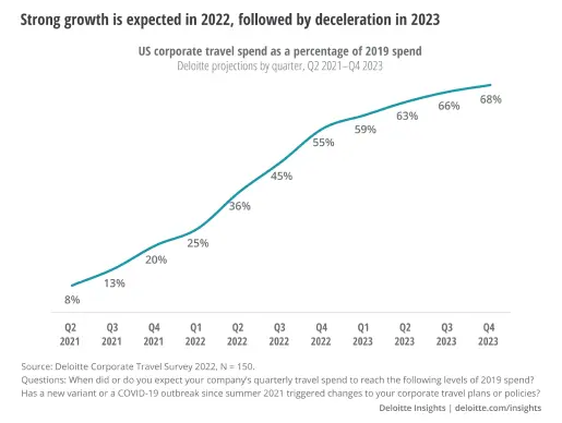
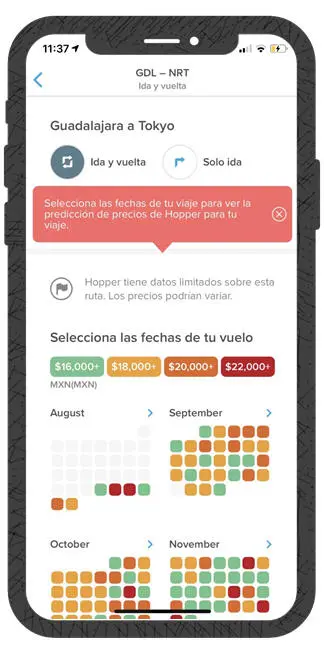
Travel spending was projected to keep climbing back toward its pre-pandemic level — the travelers were there, but the apps weren't keeping up.
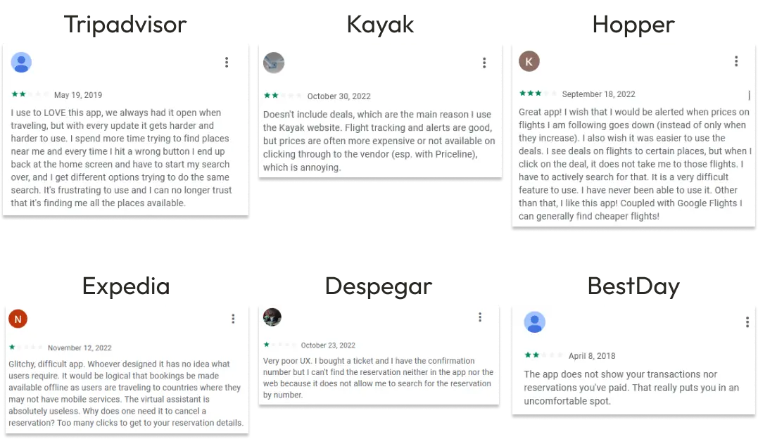
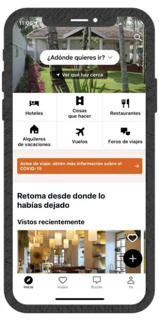
I compared six of the most-used travel apps — TripAdvisor, Kayak, Hopper, Expedia, Despegar and BestDay — to learn from what each does well and badly, and read through their real user reviews.
The same complaints kept showing up: information that's hard to find, nothing available offline, and prices and reservations that are difficult to track down.
Survey
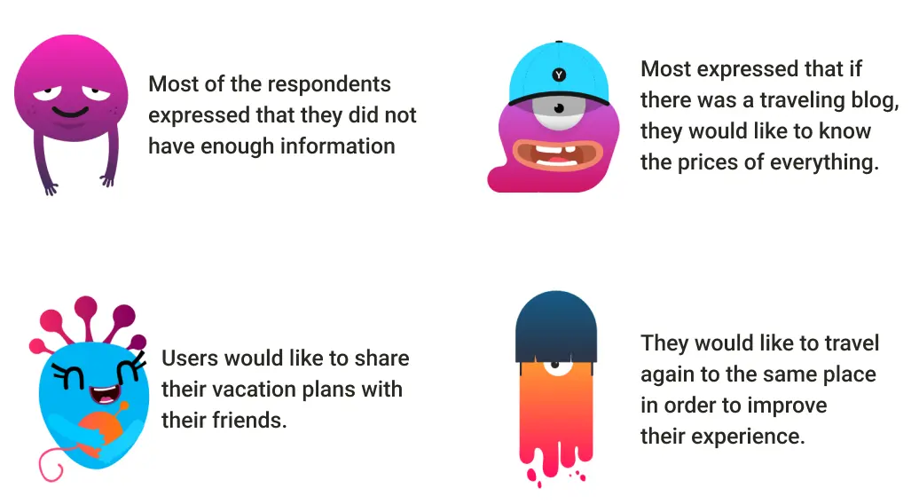
Survey respondents were consistent about what was missing: more information up front, clear prices, a way to share plans with friends, and a way to look back at a trip they'd already taken.
Persona
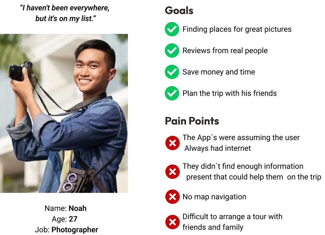
Noah, 27, photographer, travels to find great photo spots with his friends. His pain points line up with the research: apps that assume a signal, not enough help mid-trip, and no easy way to plan as a group.
Design process
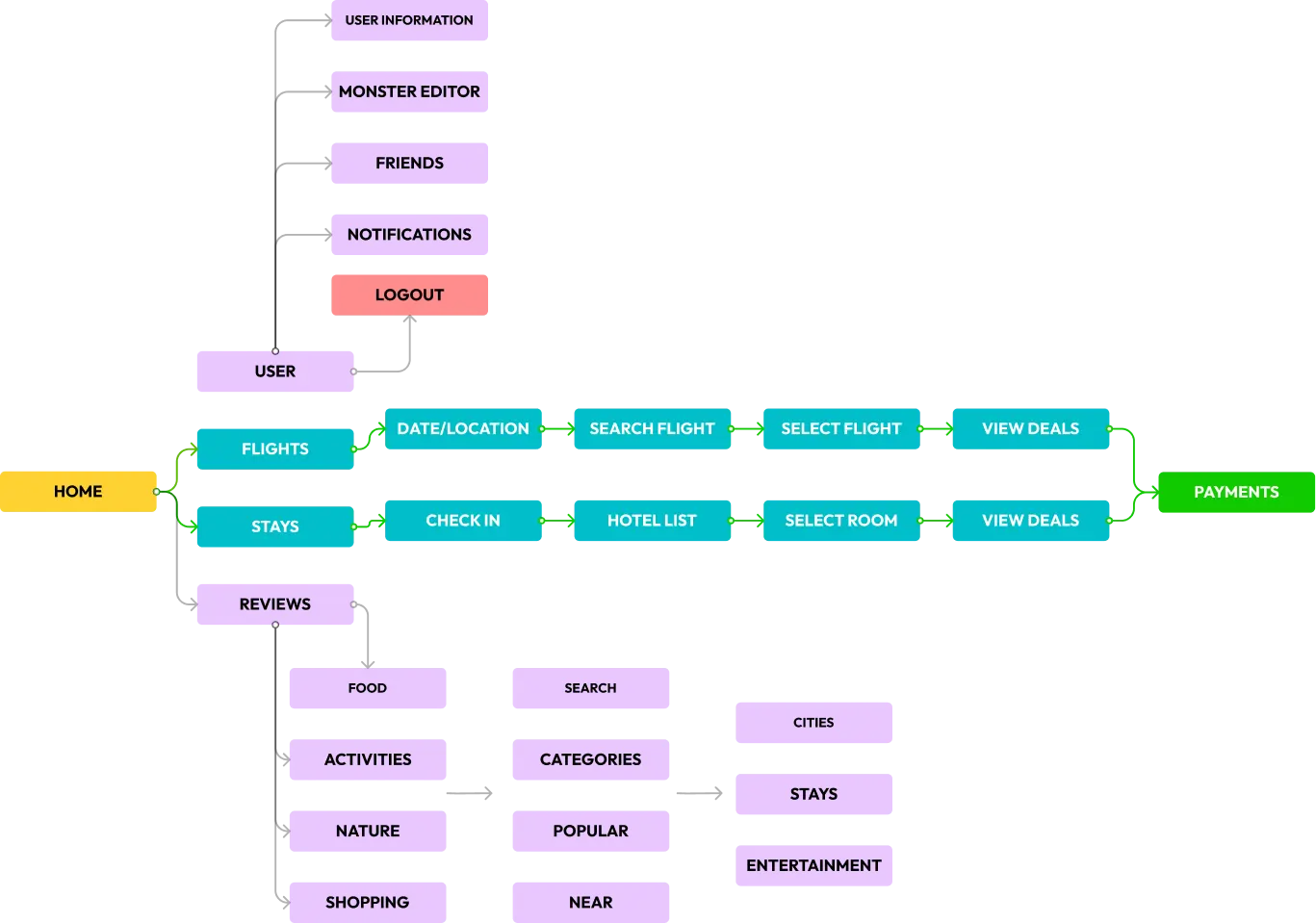
The site map came first — how a traveler moves from Home into Flights, Stays and Reviews, and how the Monster Editor and friends hang off the profile.
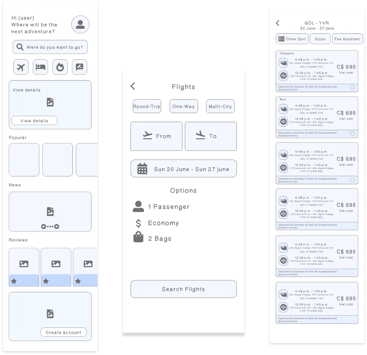
Low-fidelity wireframes got the flight search right before any visual design.
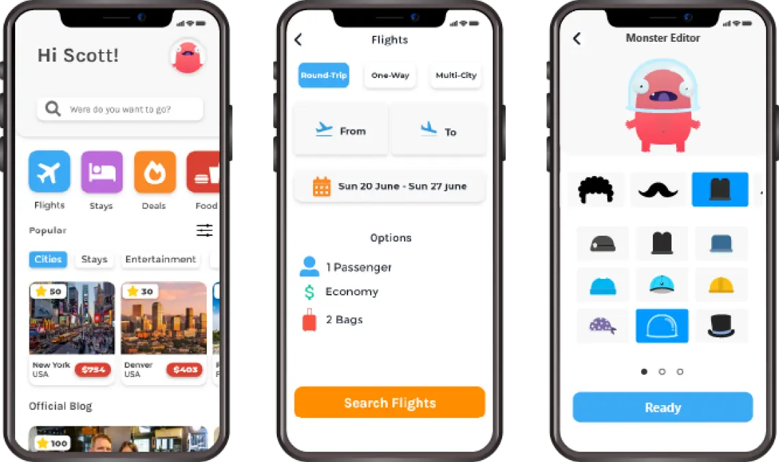
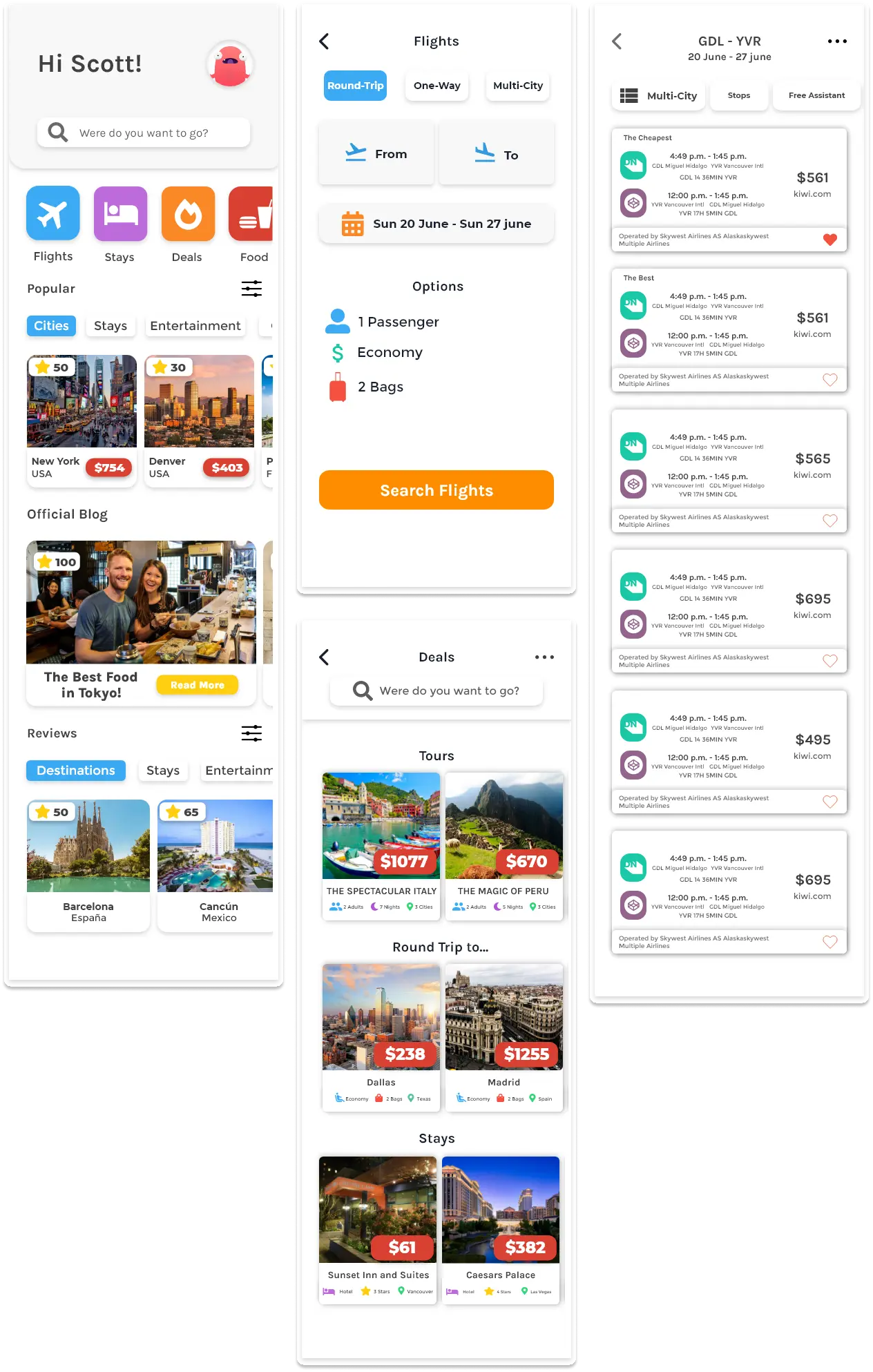
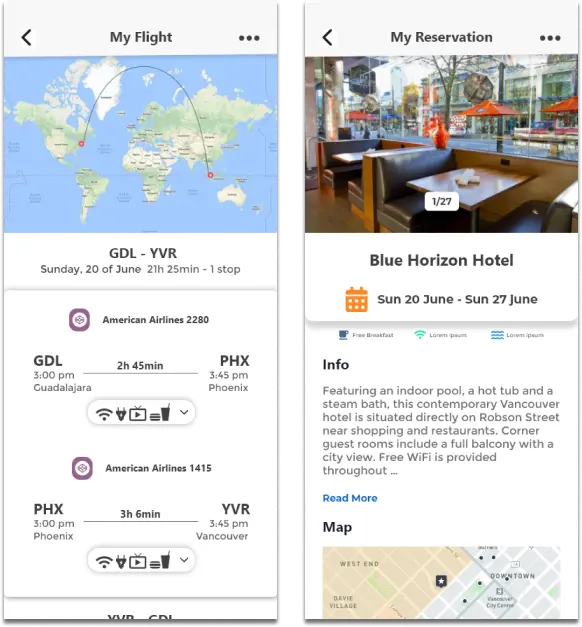
Then the high-fidelity screens. These early-iteration designs are reviewed for defects in the QA section.
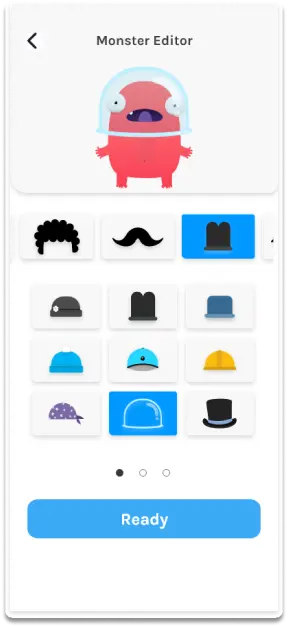
Home, flight search and the Monster Editor — early iteration.Home, search, deals and results — early iteration.
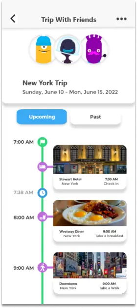
My Flight and My Reservation — early iteration.Trip With Friends — early iteration.
Why monsters
Travel apps look alike: a search box and a list of prices. I wanted Monster Travel to feel more like a game — the way apps like LINE are remembered for their characters, not their features. So your profile isn't a photo or a generic avatar: it's a Monster you build yourself.
The test put that to the question. Users saw several avatar proposals, and the monsters won every time. The reason people gave was freedom: they could make an avatar their own way, instead of picking a generic one.
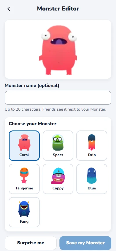
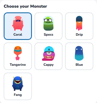
The cast. In the rebuilt app these are the seven Monsters you choose from.
The rebuilt app
The rebuild keeps the original's identity — the monsters, the rounded cards, the category tiles — and fixes what the review found. It covers searching and booking a flight, checking it without a connection, planning a trip with friends and making a Monster.
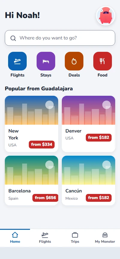
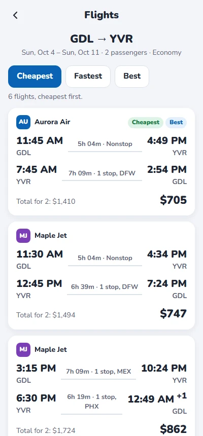
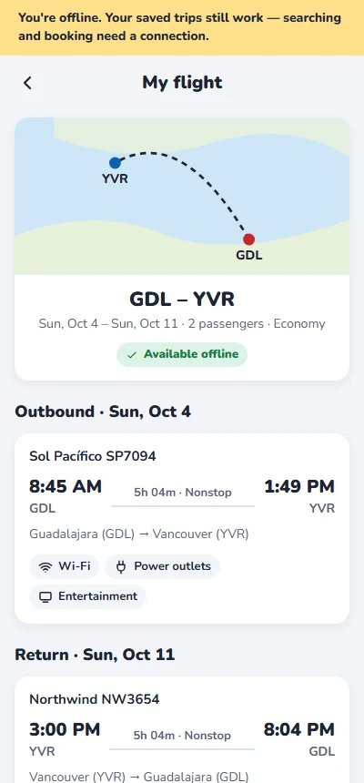
Home, with your Monster.Results, with tags that are calculated.My flight, with no connection.
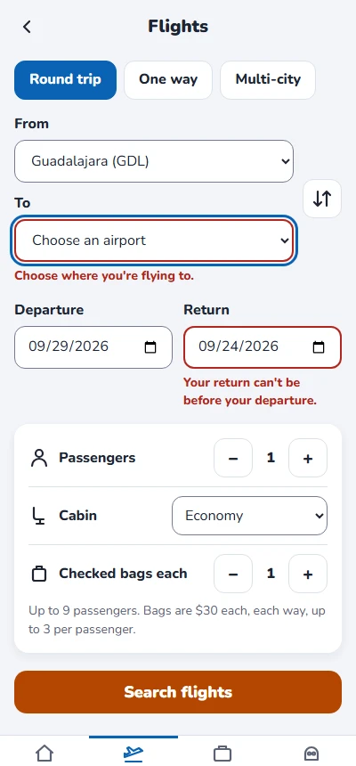
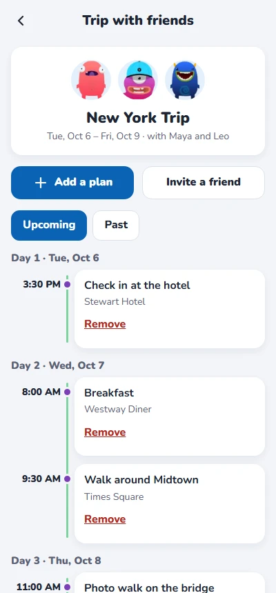
Search, with an error next to each field.A trip planned with friends.The Monster Editor: pick your Monster, name it, save it.
Design decisions
1
Offline is a state you can see
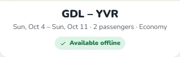
"Apps assume you always have internet" was Noah's first pain point. Every booked flight says Available offline, a banner appears when the signal drops, and it says what still works — not just that something failed.
2
Labels are calculated, not written in
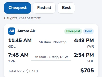
The original results called a $561 flight "The Cheapest" with a $495 one further down. Cheapest, Fastest and Best are now worked out from the actual list.
3
The total is on the button
Fare × passengers, plus bags each way — "Book for $1,410". What the traveler reads last is what they'd pay.
4
Plans stay in order, and clashes are caught
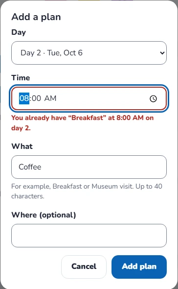
A new plan lands in time order on its day, and a plan at the same time as another one says which — before a group ends up in two places at once.
5
The Monster is yours until you save it
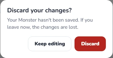
The preview changes as you choose, Save stays off until something changes, and leaving with unsaved changes asks first. Surprise me is there for anyone who'd rather be surprised.
6
Readable, and usable by everyone
No text smaller than 12 px, every text color at WCAG AA, every control at least 44 px, and the Monster options named for screen readers and operable with the arrow keys.
Validation
The original prototype was tested with 10 users, all of whom had traveled recently, and the test is where the monsters won. The rebuilt app hasn't been tested with users yet; it was validated against 34 test cases.
Most travel help stops at "how to book". Noah's questions come later: at the airport with no signal, planning a day with friends, or wondering why a search won't run. The help articles are written for those moments, with the exact words the app shows.
The samples below are excerpts. Each one opens with a short note on who it's for and why it's written the way it is.
Documentation plan
Audiences
Audience
Who
What they need from the docs
Traveler
Noah, before and during a trip
Find and book a flight, and trust that it's there when the signal isn't.
Trip organizer
Whoever plans the group trip
Add plans, invite friends, and know the limits before hitting them.
Support
The team answering questions
The exact message a traveler saw, why, and what to tell them.
Every step was performed in the working app, and every message is copied from the screen. The test cases check the same text, so the articles and the app can't drift apart without a test failing.
Sample 1 · One task, two situations
Audience
Traveler
Type
Task
Why it's written this way
Noah reads this at home and again at the gate — the same task in two situations. One topic with two conditions keeps both versions in step, and the offline version leads with what still works, because that's the question he has.
Show this topic for
Monster Travel Help › Your trips
Check your flight
Every flight you book is saved on your phone, so you can check it even with no signal.
Without a connection
A yellow banner tells you you're offline. Your trips still open in full; searching and booking wait until you're connected.
Select Trips.
Under Flights, select your flight.
Check your flight numbers, times, stops and layovers. Each flight in your trip is listed separately.
With a connection
Result: Your flight opens with its route map. It's also shown on Home under Your next trip.
Without a connection
Result: Your flight opens exactly as it does online, including the route map. Look for Available offline under the dates.
Tip Open your flight once before you leave for the airport, so you know where it is when you need it.
Sample 2 · A task for the group
Audience
Trip organizer
Type
Task
Why it's written this way
Two short procedures under one title, because organizers do both in the same sitting. The limits come before the steps, so nobody finds out about them on the seventh invite.
Monster Travel Help › Trips with friends
Plan a trip with friends
A trip with friends has a shared timeline, one day at a time. Everyone on the trip can see the plans.
Before you start A trip can have up to 8 people, including you. Plans can be added and friends invited only while you're connected.
Add a plan
In Trips, under With friends, select the trip, and then select Add a plan.
Choose the Day and the Time, and under What, say what the plan is — for example, Breakfast. Where is optional.
Select Add plan.
Result: The plan appears on its day, in time order. If you already have a plan at that time, the app says which one, so you can pick another time.
Invite a friend
Select Invite a friend.
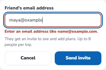
Under Friend's email address, type their email, and then select Send invite.
Result: "Invite sent to" and the address appear, and your friend shows up on the trip as Invited.
Sample 3 · A task that's meant to be fun
Audience
Traveler
Type
Task
Why it's written this way
Nobody needs instructions to play with a Monster, so the steps are few and the article's job is the two things people do miss: changes aren't kept until you save, and the options work with the keyboard.
Monster Travel Help › Your profile
Make your Monster
Your Monster is how friends see you in the app. Make it look however you like.
Select My Monster, or your Monster on Home.
Under Choose your Monster, select the one you want. The preview at the top changes as you choose.
Optionally, give your Monster a name of up to 20 characters.
Select Save my Monster.
Result: "Your Monster is saved." Your new Monster appears on Home and on your trips with friends.
Tip Can't decide? Select Surprise me and it picks a different one for you. Nothing is saved until you select Save my Monster.
Note With a keyboard, press Tab to reach the Monsters, and use the arrow keys to move between them. Each one is announced by name.
Sample 4 · Reference
Audience
Traveler · Support
Type
Reference
Why it's written this way
"Does it work offline?" has a different answer for every part of the app, so it's a table, one row per feature. The limits table gives support the number the app enforces, not a guess.
Monster Travel Help › Reference
What works offline, and limits
What works without a connection
Feature
Without a connection
Your booked flights
Work in full, including the route map
Trips with friends
You can read the plan; adding plans and inviting friends wait until you're connected
Your Monster
Works
Searching for flights
Needs a connection
Booking a flight
Needs a connection
Limits
What
Limit
Passengers
1 to 9 per booking
Checked bags
Up to 3 per passenger, $30 each, each way
How far ahead
Up to 330 days from today
People on a trip
Up to 8, including you
Plan names
Up to 40 characters
Monster names
Up to 20 characters
Sample 5 · Troubleshooting
Audience
Traveler · Support
Type
Troubleshooting
Why it's written this way
Each problem is titled with the exact words on screen, so a traveler can search for what they see and support can match what a customer reads to them. Every entry says why it happened and what to do next.
Monster Travel Help › Troubleshooting
Fix a problem
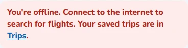
“You're offline. Connect to the internet to search for flights.”
Why it happens: Prices change by the minute, so the app only searches with a live connection.
What to do: Connect to Wi-Fi or mobile data and search again. Your booked flights are still in Trips.
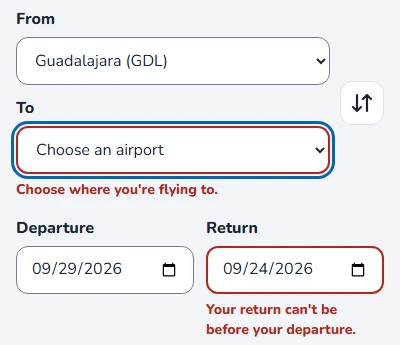
“Your return can't be before your departure.”
Why it happens: The return date is earlier than the departure date.
What to do: Change either date. For a trip with no return, select One way.
“You can book up to 330 days ahead.”
Why it happens: Flights can't be booked more than 330 days before they leave.
What to do: Choose an earlier date, or check again closer to your trip.
“From and To can't be the same airport.”
Why it happens: The same airport is chosen in both fields.
What to do: Change one of them. To turn your trip around, select the arrows between the two fields.
“You already have [plan] at [time] on day [n].”
Why it happens: Another plan on the same day starts at the same time.
What to do: Choose another time, or remove the other plan first.
“A trip can have up to 8 people.”
Why it happens: You, your friends and the people you've invited already add up to 8.
What to do: Plan a second trip for the rest of the group.
“Discard your changes?”
Why it happens: You changed your Monster and tried to leave without saving.
What to do: Select Keep editing, and then Save my Monster. Select Discard only if you want to keep your Monster as it was.
“We couldn't find this trip”
Why it happens: The flight was removed, or it was booked on a different phone.
What to do: Open Trips on the phone you booked with.
UX writing: before and after
The copy in the original screens was reviewed with the same care as the articles.
Where
Before
Final
Why
Search box
Were do you want to go?
Where do you want to go?
A typo on the first screen, carried over from the wireframes into every search box.
Results
“The Cheapest” and “The Best”, fixed on the first two cards
Cheapest · Fastest · Best, calculated from the list
A label written into a card is wrong the moment the prices change — it already was in the mockup.
Results filter
Free Assistant (Fee Assistant in the wireframes)
Sort by Cheapest, Fastest or Best
Two spellings of a label nobody could explain. Sorting says exactly what it does.
On board
Four icons with no names
Wi-Fi · Power outlets · Entertainment · Snacks
An icon for "power" and one for "screen" are guesses; a word isn't.
Hotel amenities
Free Breakfast · Lorem ipsum · Lorem ipsum
(hotels weren't rebuilt)
Placeholder text was left in a finished screen. Reported as an open defect.
Monster Editor
Ready
Save my Monster
"Ready" doesn't say what happens. The new label does, and it's off until there's something to save.
No connection
(no message)
You're offline. Your saved trips still work — searching and booking need a connection.
Offline was the top pain point, so the app says what still works, not only what doesn't.
How the messages are written
One cause, one message — the same date field has three different errors, each saying what to fix.
Say what still works before what doesn't.
Name the thing — the plan, the time, the email address — so the message makes sense on its own.
Ask first only when the loss is real: removing a flight and leaving an unsaved Monster ask; removing a plan offers Undo.
Style conventions
The articles follow the Microsoft Writing Style Guide:
Second person, present tense, active voice.
Select instead of "tap", so the steps work on a touchscreen and with a keyboard.
Interface labels in bold, spelled exactly as they appear on screen.
Messages quoted word for word, so they can be searched.
One action per step, with the result right after the last one.
QA
Review and testing
Monster Travel was reviewed in two stages: my own first-project screens, against the research they were meant to answer, and the rebuilt app — screenshot reviews at 400 px, a contrast and target-size audit, axe-core on 21 states, and 34 test cases.
Reviewing your own early work is a good test of objectivity. Every defect below is in the project's own work, and each one is fixed and retested — except one in the hotel screens, which weren't rebuilt, so it stays open and says so.
Test plan
Objective
Make sure a traveler can find and book a flight with the right total, open it with no connection, plan a trip with friends and make a Monster — with clear errors, nothing lost by accident, and every screen at WCAG AA.
Scope
In scope
Home, flight search, results, booking and Trips
Offline behavior on every screen
Trip with friends: plans and invites
The Monster Editor
Accessibility of every screen at 400 px
Out of scope
Stays, deals, food and reviews — not rebuilt
Payments, and real flight data
Browsers other than Chrome, and native iOS
Real network loss — offline is simulated
Approach
Pass
What was reviewed
How
1 · Design review
The early-iteration screens and wireframes
Each screen checked against the research findings and the persona's pain points; colors measured from the original files
2 · Screenshot review
Every state of the rebuilt app
Real screenshots at 400 px, read one by one
3 · Accessibility audit
The rebuilt app
Contrast measured with the WCAG 2.1 formula, axe-core on 21 states, target size, keyboard and focus
4 · Functional testing
The rebuilt app
34 test cases: boundary values, equivalence partitioning, state transitions and negative tests
Environment: Chrome (latest), Windows 11, 400 px wide · axe-core 4.10. Offline is simulated with the prototype's offline mode.
Risks, in priority order
Risk
Why it matters
Covered by
High The trip isn't there with no signal
It's the top pain point, and it happens at the airport
TC16, TC18–TC21
High A price or label is wrong
A wrong total or a "Cheapest" that isn't breaks trust instantly
TC11–TC15
Medium A search can't be completed
Dates and airports are where travel forms fail
TC03–TC10
Medium The group plan gets messy
Clashes, duplicates and limits confuse everyone at once
TC22–TC26
Medium Work is lost
A Monster or a flight gone by accident
TC28–TC31, TC34
Medium A screen can't be used with a keyboard, touch or low vision
Accessibility is a requirement, not a feature
Contrast audit, axe-core, TC05, TC09, TC27, TC33
Exit criteria
Every High-risk case passes, no High-severity defect stays open, and axe-core reports zero violations. All three were met.
Defects found — 16, 15 fixed
Eight in the early-iteration screens, eight in the rebuild. Each report says where it was found, what was expected, what happened, and how it was fixed and verified.
Early iteration
E-01 · [Search] “Were do you want to go?”
Found in: design review · wireframes and every search box
Severity: LowPriority: HighFixed
Expected"Where do you want to go?"
Actual"Were", on Home and Deals — copied from the wireframe into every screen with a search box.
Fix: Corrected. Verified by TC01, which checks the placeholder word for word.
E-02 · [Results] “The Cheapest” isn't the cheapest
Found in: design review · early iteration
Severity: HighPriority: HighFixed
ExpectedThe flight tagged Cheapest has the lowest price in the list.
Actual"The Cheapest" is $561 while a $495 flight sits further down — and all six results show the same times and airports with different prices.
Fixed
Fix: Cheapest, Fastest and Best are calculated from the actual flights, and every result is a different flight. Verified by TC11 and TC12.
E-03 · [Accessibility] Buttons and placeholders fail contrast
Found in: accessibility audit · colors measured from the original screens
Severity: MediumPriority: MediumFixed
ExpectedText at 4.5:1 or more.
ActualWhite on the orange Search Flights button 2.33:1; white on the blue chips and the Ready button 2.54:1; the search placeholder 2.03:1.
Fix: Darker orange and blue, and a darker placeholder. Every pair now measures 5.50:1 or more — full numbers in the accessibility audit.
E-04 · [Offline] The research's top finding has no screen
Found in: design review · checked against the persona's pain points
Severity: MediumPriority: HighFixed
ExpectedSomething shows what works with no connection, and what happens when you try what doesn't.
ActualNo screen shows an offline state or which trips are saved on the phone — and My Flight and My Reservation are built around live maps.
Fix: An offline banner, an Available offline badge on every booked flight, a route map that needs no connection, and an offline state on every screen that needs one. Verified by TC16 and TC18–TC21.
E-05 · [My Reservation] Lorem ipsum in the hotel amenities
Found in: design review · early iteration
Severity: MediumPriority: MediumOpen · hotels not rebuilt
ExpectedReal amenities under the hotel name.
Actual"Free Breakfast · Lorem ipsum · Lorem ipsum".
Status: Stays weren't rebuilt, so this stays open and reported rather than marked fixed.
E-06 · [Results] Flight details too small to read on a phone
Found in: design review · early iteration
Severity: MediumPriority: MediumFixed
ExpectedTimes, airports and stops readable at arm's length.
ActualAirport names, durations and "Operated by…" are set at a fraction of the body size — the information travelers compare flights by is the hardest to read.
Fix: Times at 20 px, airports and stops at 13–14 px, and nothing under 12 px. Verified in the 400 px screenshots.
E-07 · [My Flight] On-board amenities are icons with no names
Found in: design review · early iteration
Severity: LowPriority: MediumFixed
ExpectedEach amenity can be identified by anyone, including screen reader users.
ActualFour small icons — Wi-Fi, a plug, a screen, a drink — with no text.
Fix: Each amenity has its icon and its name. Verified by TC16.
E-08 · [Monster Editor] Options have no names, and pages have no labels
Found in: design review · early iteration
Severity: LowPriority: MediumFixed
ExpectedEach part and option has a name; it's clear what each page of options holds.
ActualHats, hair and a mustache as pictures only, split across three pages shown by dots.
Fix: Every Monster has a name — Coral, Specs, Drip, Tangerine, Cappy, Blue and Fang — all seven on one screen with no pages, as a radio group that works with the arrow keys. Verified by TC27.
Rebuild
P-01 · [Home] Every destination card is underlined
Found in: screenshot review at 400 px
Severity: LowPriority: LowFixed
ExpectedClean cards; the whole card is the link.
ActualCity, country and price all underlined, inherited from the link style.
Fix: Cards drop the underline. Verified in the screenshots.
P-02 · [Search] Airport names cut off
Found in: screenshot review at 400 px
Severity: MediumPriority: MediumFixed
ExpectedThe chosen airport is readable.
ActualFrom and To side by side read "Guadalajara (G".
Fix: From and To stacked at full width, with Swap beside them. Verified in the screenshots and TC10.
P-03 · [Monster Editor] Choices hidden off screen
Found in: screenshot review at 400 px
Severity: MediumPriority: MediumFixed
ExpectedEvery choice visible at once — the same problem E-08 found with the original's three pages of options.
ActualThe first build put the choices in a row that scrolled sideways, with the last one cut off and no sign there was more.
Fix: All seven Monsters in a grid, on one screen. Verified in the screenshots.
P-04 · [Trip with friends] Plan times break onto two lines
Found in: screenshot review at 400 px
Severity: LowPriority: LowFixed
Expected"8:00 AM" on one line.
Actual"8:00" and "AM" on separate lines.
Fix: A wider time column that never wraps. Verified in the screenshots.
P-05 · [Accessibility] Field borders too faint to see
Found in: contrast audit, twice
Severity: MediumPriority: MediumFixed
ExpectedA field's border at 3:1 or more against what's around it (WCAG 1.4.11).
ActualThe Home search box at 1.31:1. The first fix still measured 2.86:1 where fields sit on the grey background.
Fix: One darker border for every field: 4.23:1 on white, 3.88:1 on grey.
P-06 · [All screens] Buttons act twice after you revisit a screen
Found in: functional testing · TC10 and TC23 failed
Severity: HighPriority: HighFixed
Open Flights, go to Home, and open Flights again.
Select Swap From and To.
ExpectedFrom and To swap.
ActualNothing changes: the swap ran twice. Steppers moved by two, and Add a plan opened two dialogs.
Cause and fix: Each visit to a screen added its button handlers again to the same container. Every screen now starts in a fresh one. Verified by TC09, TC10 and TC23.
P-07 · [Offline] The offline banner isn't announced
Found in: axe-core · four offline states
Severity: MediumPriority: MediumFixed
ExpectedScreen reader users hear that the connection dropped, and the banner sits in a page region.
ActualThe banner was outside every landmark (region) and silent when it appeared.
Fix: The banner lives in the app header as a status message. Verified by axe-core on the same states.
P-08 · [Offline] The link to Trips breaks out of its sentence
Found in: screenshot review of the offline search
Severity: LowPriority: MediumFixed
Expected"…Your saved trips are in Trips." as one sentence.
Actual"Trips" floated to the far right, with the period on its own.
Fixed
Fix: The message is laid out as plain text. Verified in the screenshots.
Accessibility audit
Contrast, measured
Original colors were sampled from the design files; every ratio uses the WCAG 2.1 formula. AA requires 4.5:1 for text and 3:1 for field borders.
Element
Early iteration
Rebuild
Search button text
2.33:1
5.50:1
Selected chips and main buttons
2.54:1
6.06:1
Search placeholder
2.03:1
6.11:1
Price tags
4.53:1
5.62:1
Field borders
—
4.23:1 · 3.88:1 on grey
Offline banner
—
12.01:1
Target size
Every control in the app is at least 44 px tall — tabs, steppers, chips, Monster options and the Remove links included. TC33 measures them on every screen.
Automated scan (axe-core)
Zero violations in all 21 states scanned: Home with the guide open and with a search error, flight search with and without errors, results, flight details, the booking confirmation, My flight, Trips, four offline states, the trip with friends, an invite error, the add-plan dialog with errors, the Past tab, the Monster Editor and its hats, the discard dialog, and a trip that doesn't exist.
Keyboard and focus
A search with errors moves focus to the first field that needs attention (TC05).
At a stepper's limit, focus moves to the button that still works (TC09).
Monster options are a radio group: the arrow keys choose and move focus together (TC27).
Closing a dialog returns focus to the button that opened it (TC15, TC23).
Every screen change moves focus to the new screen's content.
Test cases — 34 run, 34 passed
34
Test cases executed
34
Passed
1
Defect found during execution — fixed and retested
0
axe-core violations
Home 4 cases
ID
Test
Technique
Expected result
Result
TC01
Home content
Positive
"Hi Noah!", the Monster, "Where do you want to go?", 4 priced destinations, 4 categories
Pass
TC02
A section outside the prototype
Usability
Says it isn't part of the prototype instead of doing nothing
Pass
TC03
Home search
Equivalence partitioning
Empty and unknown each explain; "den" opens the search to Denver
Pass
TC04
A destination card
Positive
Opens the search from Guadalajara to that city
Pass
Flight search 6 cases
ID
Test
Technique
Expected result
Result
TC05
No destination
Negative
A message linked to the field, marked invalid, with focus on it
Pass
TC06
Same airport both ways
Negative
"From and To can't be the same airport."
Pass
TC07
Dates
Boundary values
Yesterday, 331 days out and a return before departure refused; 330 days accepted
Pass
TC08
One way
Equivalence partitioning
Return is hidden and not required
Pass
TC09
Passengers and bags
Boundary values
1 to 9 passengers, 0 to 3 bags; at a limit the button disables and focus moves
Pass
TC10
Swap
Positive
From and To exchange
Pass Failed first run → P-06
Results and booking 7 cases
ID
Test
Technique
Expected result
Result
TC11
Cheapest first
Positive
6 flights in price order; "Cheapest" only on the lowest price
Pass
TC12
Sort by Fastest
State transition
Ordered by total travel time, and the status says so
Pass
TC13
Round trip against one way
Equivalence partitioning
Both flights and a total for 2; one flight, per person
Pass
TC14
The total
Boundary values
Fare × 3 passengers plus 2 bags each way each, on the button
Pass
TC15
Book, then Cancel, then Book
State transition
Asks with the total; Cancel books nothing; Book saves and opens the flight
Pass
TC16
My flight
Positive
Both directions, named amenities, a layover when there's a stop, Available offline
Pass
TC17
Where the booking shows up
Positive
In Trips and as "Your next trip" on Home
Pass
Offline 4 cases
ID
Test
Technique
Expected result
Result
TC18
Search with no connection
Negative
A banner says what still works; searching explains and stays put
Pass
TC19
Results and details offline
Negative
An offline state instead of stale prices; no Book button
Pass
TC20
A booked flight offline
Positive
Opens in full, and Trips still lists it
Pass
TC21
Trip with friends offline
State transition
Readable; Add a plan and Invite disabled, with the reason
Pass
Trip with friends 5 cases
ID
Test
Technique
Expected result
Result
TC22
The shared trip
Positive
4 days, the sample plans in time order, three Monsters
Pass
TC23
Add a plan
Boundary values
Required fields, a time clash and 41 characters refused; a valid plan lands in order
Pass Failed first run → P-06
TC24
Remove, then Undo
State transition
The plan goes, and Undo brings it back
Pass
TC25
Invites
Boundary values
Empty, malformed and repeated refused; the ninth person refused at 8
Pass
TC26
Past tab
Positive
An empty state that explains itself
Pass
Monster Editor 4 cases
ID
Test
Technique
Expected result
Result
TC27
Choose with the keyboard
Accessibility
Seven named Monsters in a radio group: arrow keys choose and move focus; the preview's name updates
Pass
TC28
Save
State transition
Off until something changes; saves the chosen Monster and its name
Pass
TC29
Leave without saving
Negative
Asks first; Keep editing stays; Discard leaves without saving
Pass
TC30
Surprise me
Positive
A different Monster, not saved until Save
Pass
Removal, errors and persistence 4 cases
ID
Test
Technique
Expected result
Result
TC31
Remove a flight
State transition
Asks first; Trips shows the empty state
Pass
TC32
A trip that doesn't exist
Negative
Explains why and links back to Trips
Pass
TC33
Measure every control
Accessibility
At least 44 px tall on every screen, dialog and form
Pass
TC34
Reload the app
State transition
The Monster, plans and invites are still there
Pass
Traceability
Every requirement maps to the tests that check it and the defects that broke it.
Requirement
Tests
Defects
Status
Booked trips work without a connection, and the app says so
TC16, TC18–TC21
E-04, P-07, P-08
Fixed
Prices, totals and labels are right
TC11–TC15
E-02
Fixed
A search can be completed, and errors explain themselves
TC03–TC10
E-01, P-02, P-06
Fixed
A group can plan a trip without clashes or surprises
TC22–TC26
P-04, P-06
Fixed
Nothing is lost by accident
TC24, TC28–TC31, TC34
—
Met
Everything on screen is readable and named
TC16, TC27, screenshot reviews
E-06, E-07, E-08, P-01, P-03
Fixed
No placeholder content in finished screens
Design review
E-05
Open
WCAG AA, keyboard-operable, 44 px targets
Contrast audit, axe-core, TC05, TC09, TC27, TC33
E-03, P-05, P-07
Fixed
Decision log
1
Review the screens against the research
On their own, the early screens looked finished. Held up against Noah's pain points, the biggest gap was obvious: offline was his first complaint, and no screen answered it (E-04).
2
Measure the original, don't eyeball it
The button colors looked fine. Sampled from the design files and measured, the main button was 2.33:1 — well under half of what AA asks for.
3
Test the airport moment first
Offline cases ran on every screen before anything cosmetic, because that's where the app's promise is kept or broken.
4
Revisit screens in the tests, like people do
The most serious defect in the rebuild, P-06, only appeared when a test went back to a screen it had already used. A suite that visits each screen once would have passed it.
5
What wasn't tested — and what's next
The rebuilt app wasn't tested with users; the 10-user test was on the original prototype. Also not tested: a real loss of signal (offline is simulated), native iOS and other browsers, a manual screen-reader pass, and the parts that weren't rebuilt — stays, deals, reviews and payments. Next: a test with travelers checking a booked flight in airplane mode.