A web platform for graphic design and video editing, built for small businesses and creators — researched, designed and launched, then rebuilt as an interactive editor, documented and tested.
Small business owners and content creators need to publish good-looking posts every week, usually without a design background. The tools they had were either too basic for anything custom or too complex to learn on a deadline. OQLAR set out to be the middle ground: templates to start fast, and an editor that doesn't get in the way.
UsersSamantha, a marketing coordinator who makes social posts on tight deadlines
OQLAR launched to the public with a free plan and a $10/month Premium plan. The research, persona, flow, wireframes, high-fidelity designs and the 10-user test come from the original project. The editor shown here is an interactive rebuild of the image editor, made for this case study so it could be documented and tested end to end. Video editing wasn't rebuilt.
How the project came together
1
Research, design and launch UX/UI
Market research, six competitors, real user reviews, interviews, a persona, the flow, wireframes and high-fidelity designs, tested with 10 users — then built with the developers and launched. As its product tester, I also tested the platform itself: flows, bugs, performance and user experience.
2
Design review QA
The early-iteration design files, reviewed for defects against the flow and the persona's tasks.
3
Documentation Technical Writing
Help for creators — customizing a template, previewing and exporting, shortcuts and limits, every error message — and release notes for customers and the sales team.
4
Build & test UX/UIQA
An interactive editor that fixes what the review found, tested against 37 cases. Try it.
6
Competitors benchmarked before a single screen was drawn
10
Users tested the original prototype
37
Test cases run against the rebuilt editor
20
Defects found and reported — 19 fixed
UX/UI
Research and design
Research & competitive analysis
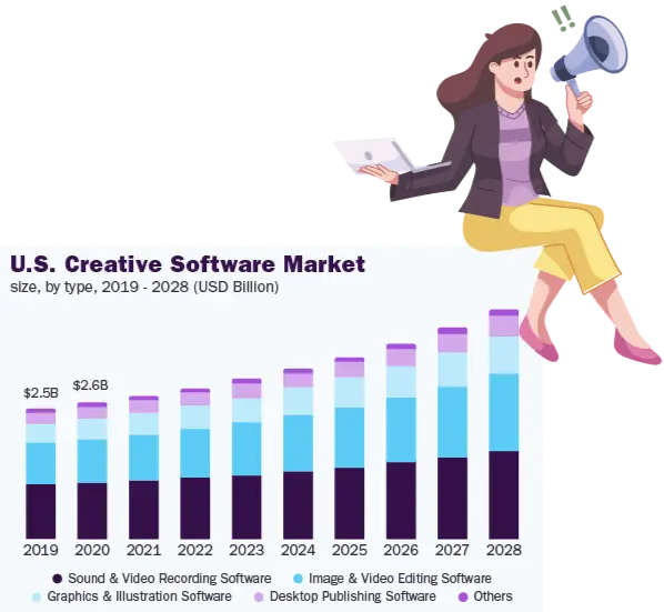
The creative software market was worth $8.47 billion in 2021 and was projected to grow 6.8% a year through 2028 — a real opportunity, but a crowded one.
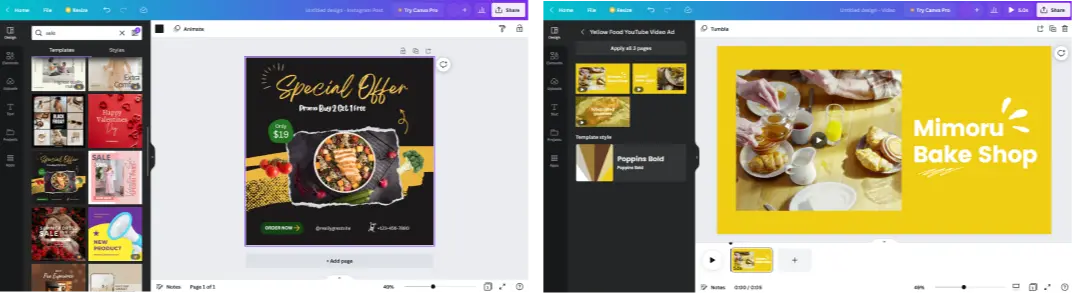
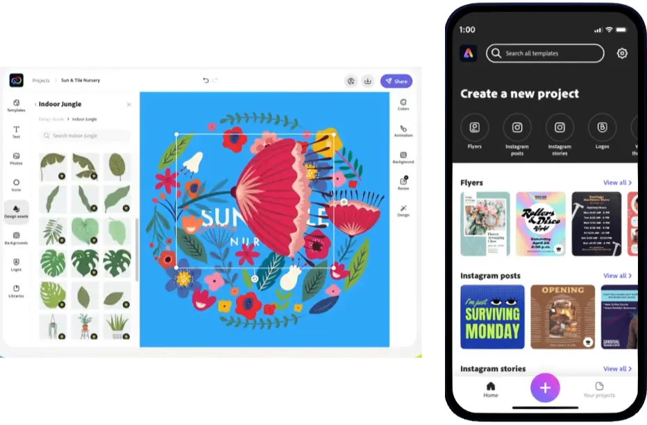
I benchmarked OQLAR against the existing players — Canva, Adobe Express, Visme, Crello, Snappa and Pixlr X — to see where an accessible, low-friction tool could still stand out.
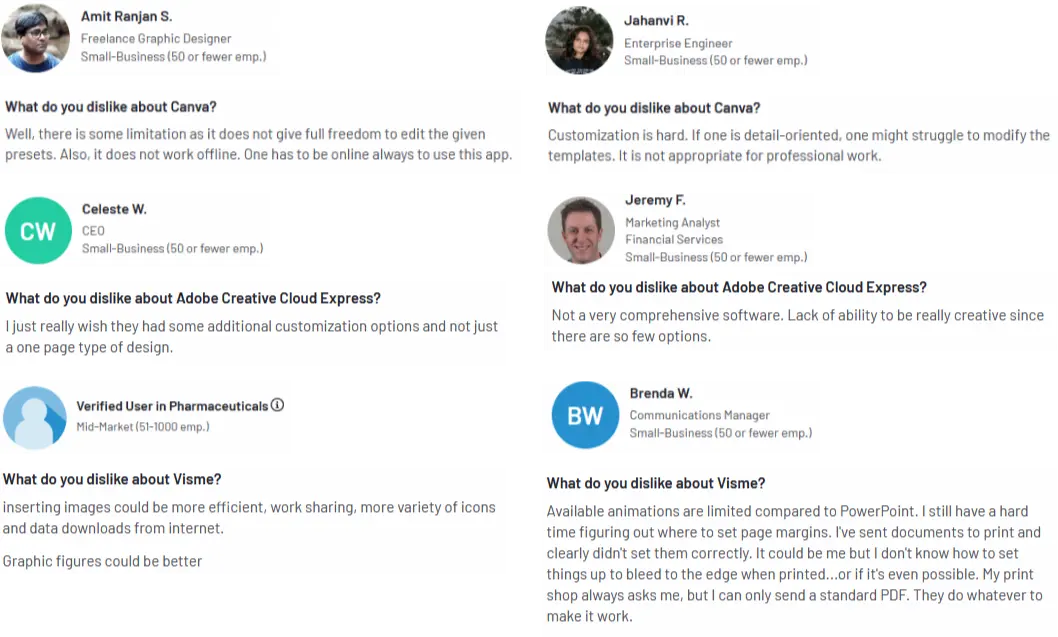
Real user reviews of those tools pointed to the same gaps: limited customization, no offline access, and features too basic for anything beyond a single-page design.
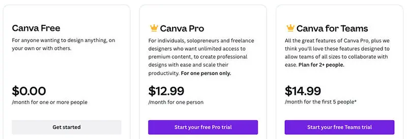
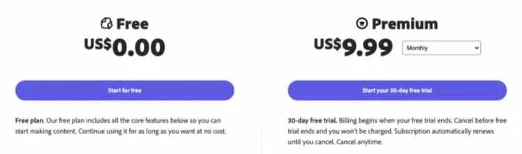
Pricing was part of the comparison too — both leaders keep their best features behind a paid plan. It set OQLAR's own entry point: a free plan, and Premium at $10 a month.
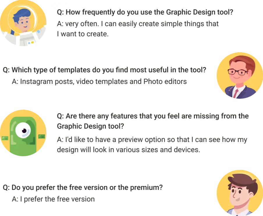
User interviews
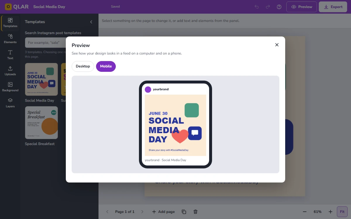
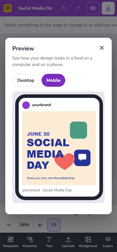
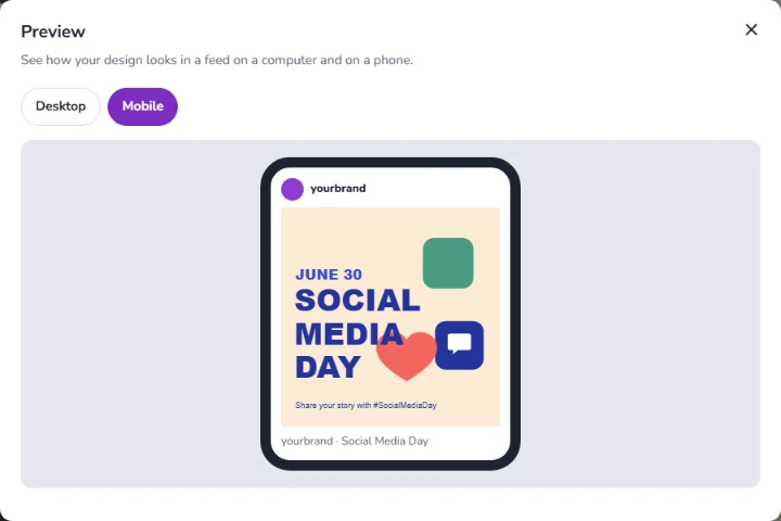
Short interviews broke down how people actually use a design tool day to day, and where it falls short. One answer shaped the rebuilt editor directly: "I'd like to have a preview option so that I can see how my design will look in various sizes and devices."
Persona
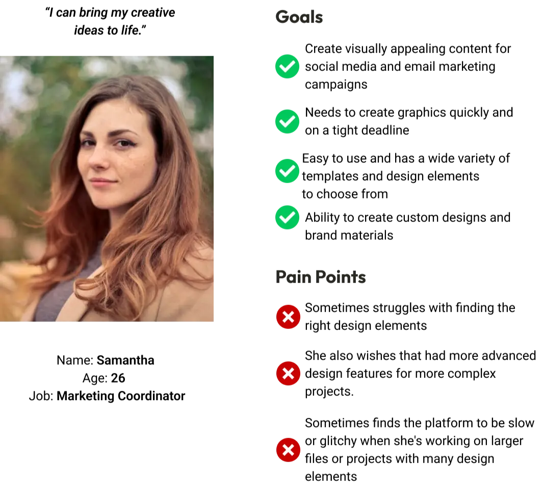
Samantha, 26, marketing coordinator, produces social posts and email graphics on tight deadlines without a design background — but wants room for custom, on-brand work when a template isn't enough. She became the reader of the help articles, too.
Design process
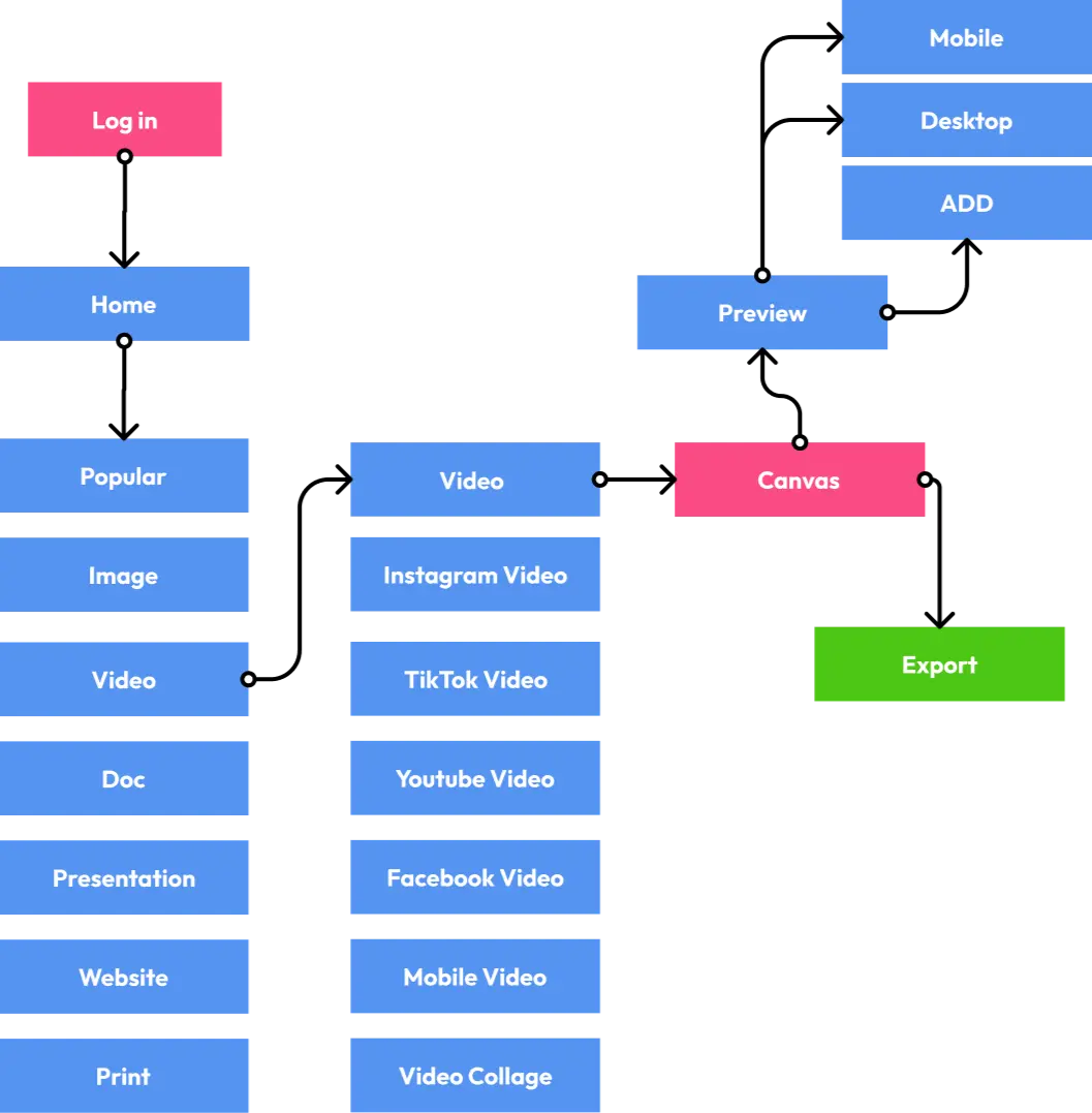
The primary flow — from home, through template categories, into the canvas, then preview and export — came first as a flow diagram.
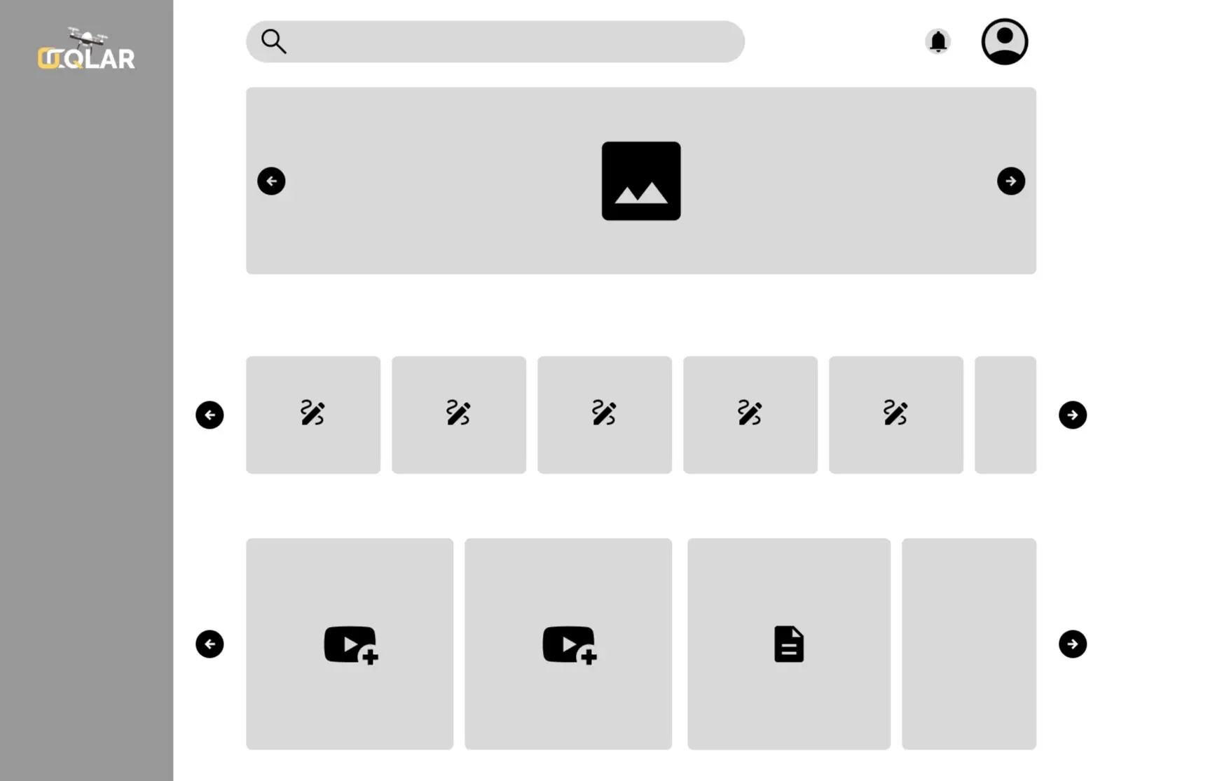
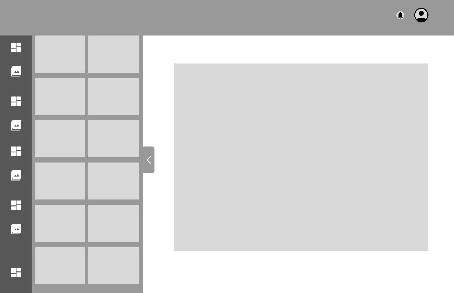
Low-fidelity wireframes locked in the dashboard and editor layout before any visual design.
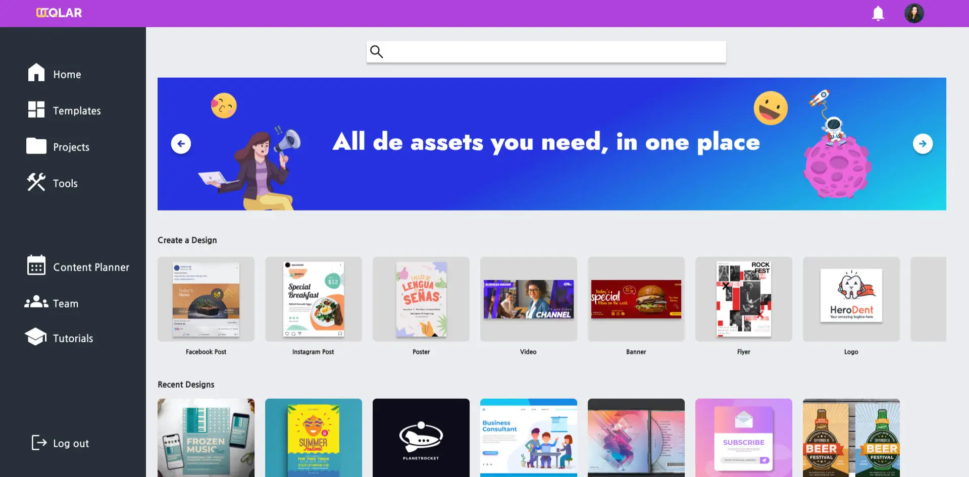
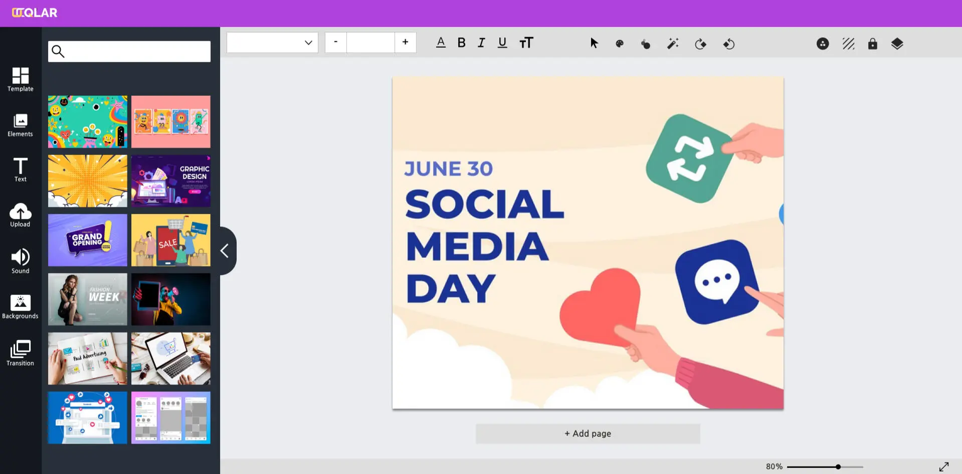
Then the high-fidelity designs: a dashboard built around quick-start templates, and an editor for building out a design. These early-iteration screens are reviewed for defects in the QA section.
Dashboard — early iteration.
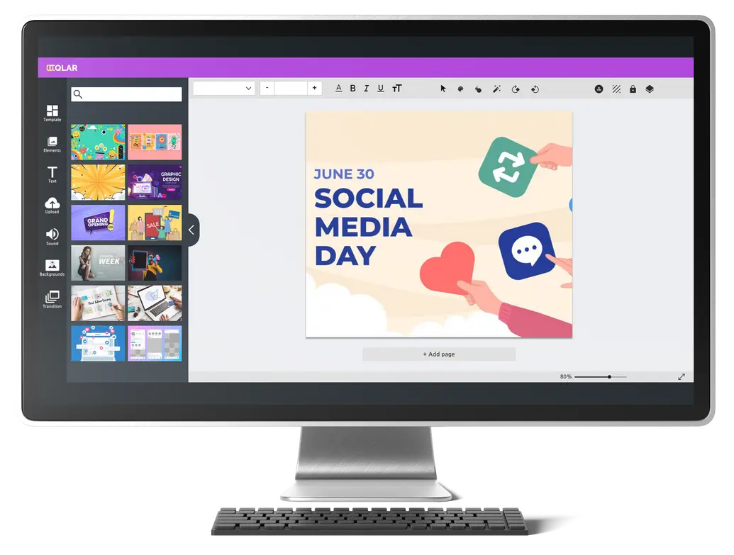
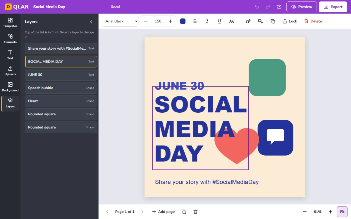
Editor — early iteration.The editor on a desktop.
The rebuilt editor
The rebuild keeps the original layout — tool rail, asset panel, canvas — and fixes what the review found. It covers the image editor end to end: templates, text, shapes, uploads, backgrounds, layers, pages, preview and export.
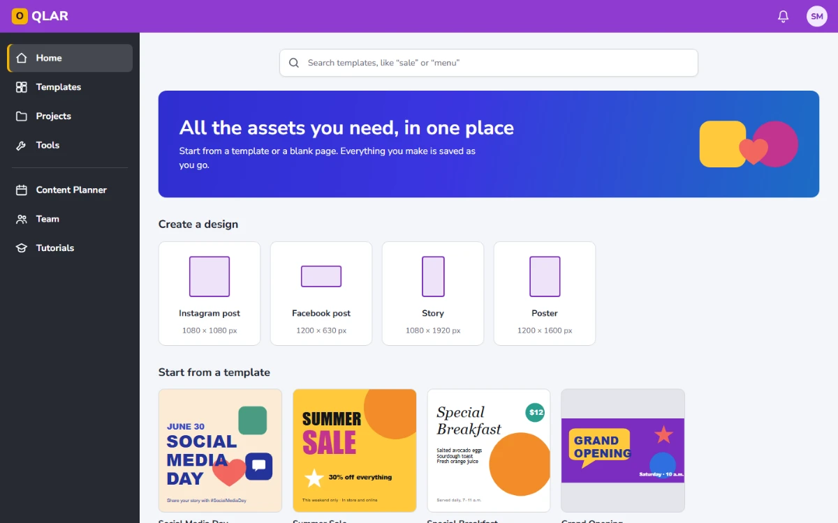
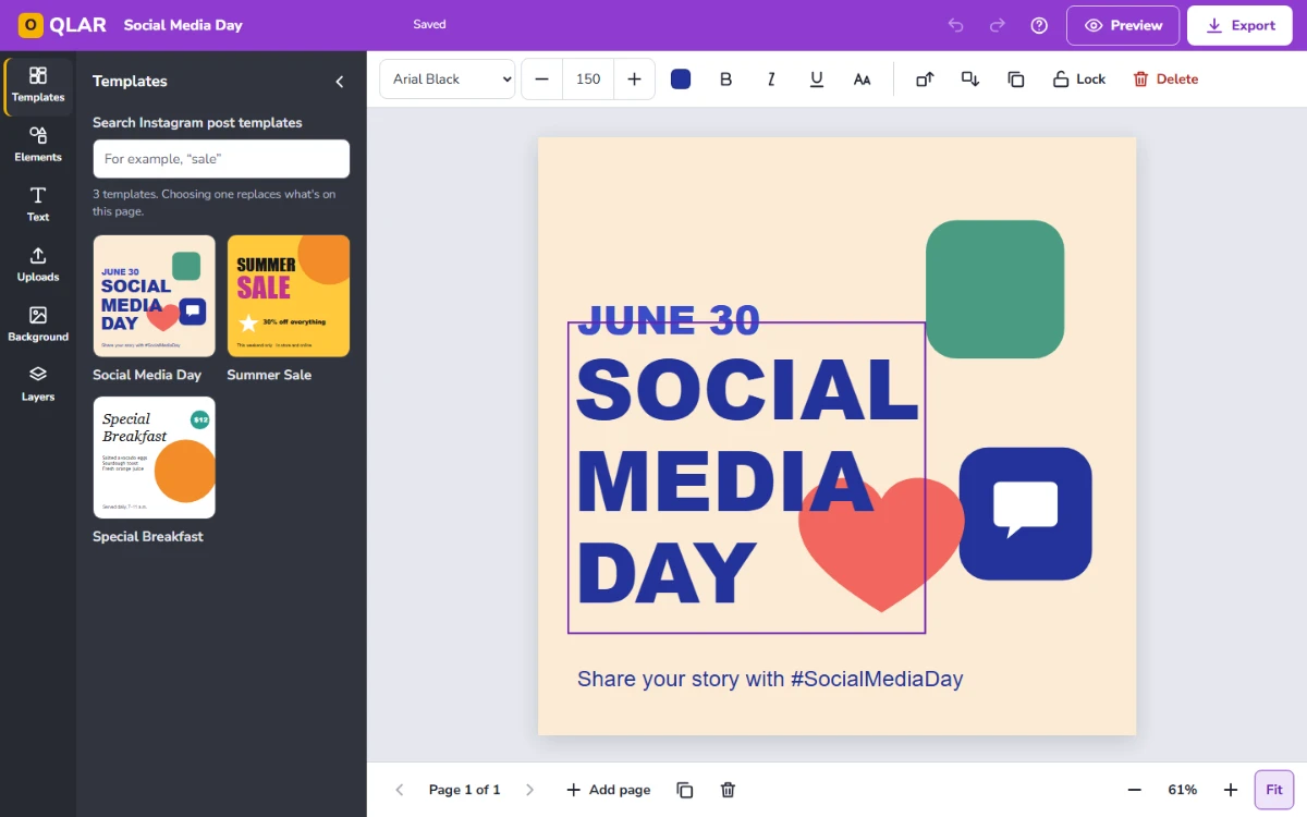
Home, with the banner typo fixed and every design size visible at once.Text selected: its tools appear, and Preview and Export are always in the top bar.
Layers: every object on the page as a list.Preview on a phone or a computer — the interview request.
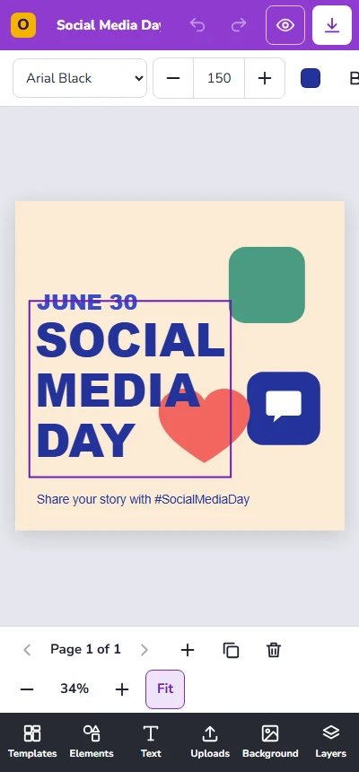
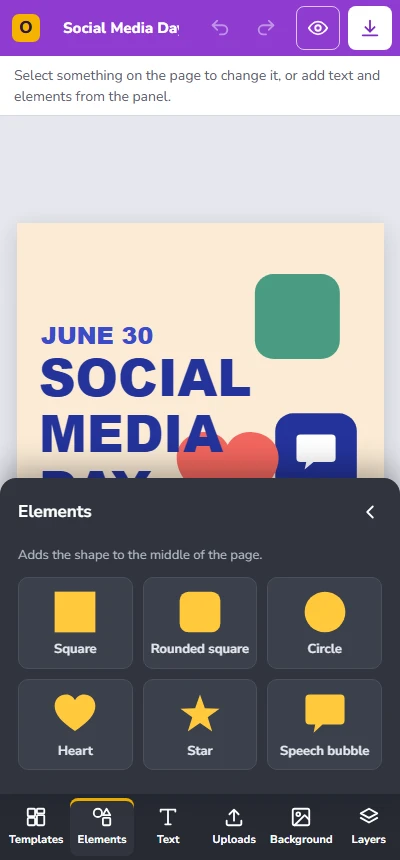
The same editor at 400 px — the tool rail moves to the bottom, and panels open as a sheet over the canvas.
Design decisions
1
Preview and Export are always one click away
The flow ended in Preview and Export, but the editor design had no button for either. Both now sit in the top bar on every screen of the editor.
2
Preview on a phone and on a computer
Straight from the interviews. Samantha posts to feeds people scroll on their phones, so she sees her design where it will actually be seen.
3
Tools appear when they apply
The early editor showed an empty font menu with nothing selected. Now the toolbar says what to do first, and shows text tools for text, color and size for shapes.
4
Every tool has a name
Icons get a visible tooltip and a name for screen readers; the actions that change or remove layers — Lock, Delete — keep their label on screen.
5
Undo instead of "Are you sure?"
Replacing a page with a template or deleting a layer happens at once, with Undo right in the message. Only deleting a whole design — which can't be undone — asks first.
6
Nothing is lost
Every change saves on its own, and the top bar says Saving… then Saved. If saving fails, it says so in words, not with a silent icon.
7
Limits are explained where they're hit
Font sizes from 8 to 400, 20 pages, images up to 10 MB, locked layers: each limit has a message that says what happened and what to do instead.
8
The canvas works without a mouse
Every layer is focusable and named — "Text: SOCIAL MEDIA DAY" — Enter edits text, arrow keys nudge it, and the Layers panel lists the page as plain buttons.
9
The exported file matches the canvas
Templates use fonts every computer already has, so the PNG that downloads looks exactly like what's on screen.
Validation
The original high-fidelity prototype was tested with 10 users to validate the flow before launch. The rebuilt editor hasn't been tested with users yet; it was validated against 37 test cases.
Samantha opens OQLAR to get a post out, not to learn software. The help articles answer the questions a template raises the moment she starts changing it — how to edit the text, why a layer won't move, what size to export — and the release notes tell customers and the sales team what changed.
The samples below are excerpts. Each one opens with a short note on who it's for and why it's written the way it is.
Documentation plan
Audiences
Audience
Who
What they need from the docs
Creator
Samantha, with a mouse, a touchscreen or a keyboard
Turn a template into her own post and export it, without reading more than she needs.
Support
The team answering customer questions
The exact message a customer saw, what caused it, and what to tell them.
Sales & customers
People who need to know what the product does now
What changed, in plain terms, and what the editor doesn't do yet.
Every step was performed in the working editor, and every message is copied from the screen. The test cases check the same text, so the articles and the product can't drift apart without a test failing.
Sample 1 · One task, two ways to work
Audience
Creator
Type
Task
Why it's written this way
The steps are the same with a mouse or a keyboard; only how you select and move things changes. So it's one topic with two condition tags instead of two articles that drift apart — and keyboard users get real steps, not a footnote.
Show this topic for
OQLAR Help › Editing
Customize a template
Change a template's text, colors and layout to make it yours. Your changes save as you go.
On Home, under Start from a template, select a template. It opens in the editor as a copy — the original template doesn't change.
Select the text you want to change.
Mouse or touch
Double-click the text. A text box opens over it.
Keyboard
Press Tab until the text is selected — each layer is read out by name, for example "Text: SOCIAL MEDIA DAY" — and then press Enter.
Type your text. To finish, press Esc or select anywhere outside the text box.
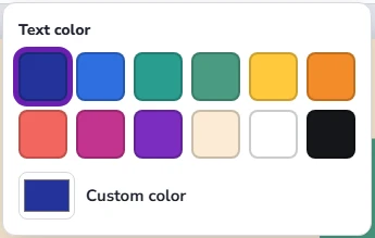
With the text still selected, use the toolbar to change it: font, size, Text color, Bold, Italic, Underline or Uppercase.
To pick a color, select Text color and choose a swatch, or select Custom color for any other color.
Move anything on the page to where you want it.
Mouse or touch
Drag it.
Keyboard
Press the arrow keys to move it 1 px at a time, or hold Shift to move it 10 px.
To keep a layer from changing while you work on the rest, select it and then select Lock.
Result: Your design is saved in Projects under the template's name. To rename it, select the name at the top of the editor and type a new one.
Tip Made a change you don't want? Select Undo, or press Ctrl+Z. Deleted layers and replaced pages can be brought back the same way.
Note Choosing another template from the Templates panel replaces everything on the current page. The message that confirms it has an Undo button.
Sample 2 · A task that ends in a file
Audience
Creator
Type
Task
Why it's written this way
The choices in the export dialog are only useful if you know which one to pick, so each option says when to use it. The result names the file exactly as it downloads, so there's no guessing where it went.
OQLAR Help › Sharing
Preview and export your design
Check how your design looks where it will be seen, and then download it as an image.
Preview your design
In the editor, select Preview.
Select Mobile to see it as a post on a phone, or Desktop to see it on a computer. If your design has more than one page, use the arrows to move between them.
Close the preview to keep editing.
Export your design
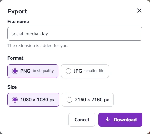
Select Export.
Under File name, keep the suggested name or type a new one. The extension is added for you.
Under Format, choose PNG for the best quality, or JPG for a smaller file.
Under Size, choose the design's own size, or double it for sharper results on high-resolution screens.
If your design has more than one page, under Pages, choose the current page only or all pages. All pages downloads one file for each.
Select Download.
Result: The file downloads to your device, and a message confirms its name and size — for example, “Downloaded social-media-day.png (1080 × 1080 px).”
Sample 3 · Reference
Audience
Creator · Support
Type
Reference
Why it's written this way
Shortcuts and limits are looked up, not read, so each one is a row. The limits table is the one support uses most: every limit is stated with the number the product enforces, so an answer never depends on memory.
OQLAR Help › Reference
Keyboard shortcuts and limits
Keyboard shortcuts
On a Mac, use ⌘ instead of Ctrl. To see this list in the editor, select Keyboard shortcuts in the top bar.
Keys
What they do
Tab
Move to the next layer on the page, then to the page tools
Enter
Start typing in the selected text
Esc
Finish typing, or clear the selection
Arrow keys
Move the selected layer 1 px
Shift + arrow keys
Move the selected layer 10 px
Delete
Delete the selected layer
Ctrl+D
Duplicate the selected layer
Ctrl+Z · Ctrl+Y
Undo · Redo
Limits
What
Limit
Font size
8 to 400. A larger or smaller number is set to the nearest limit.
Pages
From 1 to 20 per design.
Images you upload
PNG, JPG, SVG or WebP, up to 10 MB each.
File names
Up to 100 characters, without \ / : * ? " < > |
Export sizes
The design's size, or twice its size — for example, 1080 × 1080 or 2160 × 2160 px for an Instagram post.
Where designs are saved
In the browser you made them in. Another browser or device won't show them.
Design sizes
Size
Pixels
Instagram post
1080 × 1080
Facebook post
1200 × 630
Story
1080 × 1920
Poster
1200 × 1600
Sample 4 · Troubleshooting
Audience
Creator · Support
Type
Troubleshooting
Why it's written this way
Each problem is titled with the exact words on screen, so a creator can search for what she sees and a support agent can match what a customer reads to them. Every entry says why it happened and what to do next.
OQLAR Help › Troubleshooting
Fix a problem in the editor
“This layer is locked. Unlock it to move it.”
Why it happens: The layer was locked so it can't change by accident. Trying to edit or delete it shows a similar message.
What to do: Select the layer, and then select Unlock in the toolbar.
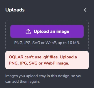
“OQLAR can't use .gif files. Upload a PNG, JPG, SVG or WebP image.”
Why it happens: The file isn't one of the image types the editor can place on a page.
What to do: Save the image as PNG or JPG in the app you made it in, and upload it again.
“banner.png” is 11.0 MB. Upload an image up to 10 MB.
Why it happens: Each image can be up to 10 MB. The message names your file and shows how big it is.
What to do: Save a smaller version — as JPG, or at a lower resolution — and upload that.
“Font sizes go from 8 to 400. Set to 400.”
Why it happens: You typed a size outside the range the editor allows. It was set to the nearest one it could use.
What to do: Nothing, if 400 works. For bigger text, spread it over more lines instead.
“A design can have up to 20 pages.”
Why it happens: The design already has 20 pages.
What to do: Delete a page you don't need, or start a new design for the rest.
“A file name can't include \ / : * ? " < > |”
Why it happens: Computers use those characters for other things, so a file can't be saved with them.
What to do: Replace them with a hyphen — for example, june-30 instead of june/30.
“Not saved — this browser's storage is full”
Why it happens: Designs are saved in your browser, and uploaded images take up the most room.
What to do: Export the design so you have a copy, and then delete designs you no longer need from Projects.
“We couldn't find that design”
Why it happens: The design was deleted, or it was made in a different browser or on a different device.
What to do: Open the browser you made it in. Designs aren't shared between browsers.
Sample 5 · Release notes
Audience
Sales & customers
Type
Release notes
Why it's written this way
Grouped by what a customer notices — new, better, fixed — with the benefit first and the feature name second. Known limitations are listed openly, so sales never promises something the editor doesn't do. Written for this rebuild: it describes what changed from the early-iteration designs, not a dated release of the launched product.
OQLAR Help › Release notes
What's new in the editor
New
See your post where it will be seen. Preview shows your design as a post on a phone or a computer.
Download without leaving the editor. Export makes a PNG or JPG at the design's size or twice its size, for one page or all of them.
Find anything on a busy page. The Layers panel lists every object, front to back.
Protect what's finished. Lock a layer so it can't be moved, edited or deleted by accident.
Work from the keyboard. Select, edit, move, duplicate and delete without a mouse. See Keyboard shortcuts and limits.
Improved
The toolbar shows only the tools for what you've selected, and every tool has a name.
Deleting a layer or a page, or replacing a page with a template, can be undone right from the message.
Home shows every design size at once, instead of a row that ran off the screen.
Fixed
Text tools no longer show up empty when nothing is selected.
The Home banner read “All de assets you need”.
Known limitations
Video editing, sound and transitions aren't part of this editor.
Designs are saved in the browser you made them in.
Templates use fonts every computer already has; custom fonts can't be added yet.
UX writing: before and after
The copy on screen was reviewed with the same care as the articles — the early-iteration designs, and my own first drafts in the rebuild.
Where
Before
Final
Why
Home banner
All de assets you need, in one place (early iteration)
All the assets you need, in one place
A typo in the largest text on the first screen.
Editor, nothing selected
An empty font menu and an empty size field (early iteration)
Select something on the page to change it, or add text and elements from the panel.
Empty controls look broken. The first thing a new user needs is what to do first.
Toolbar
15 icons with no names (early iteration)
Every icon named — Bring forward, Send backward, Duplicate — and Lock and Delete labeled on screen
An icon nobody can name is a button nobody presses.
Locked layer
Locked — unlock it to make changes. (my draft)
Unlock to make changes.
The button next to it already says Unlock; the note only needs the action. The longer draft was cut off on screen.
Upload finished
Uploaded logo.png and added it to the page (my draft)
No message — the image appears, selected. If you've moved to another page: “Uploaded logo.png on page 1.”
A message about something you can see is noise; a message about something you can't see is essential.
How the messages are written
Name the limit — "up to 10 MB", "from 8 to 400" — never just "invalid".
Say what to do next, and never blame the user.
Offer Undo instead of asking first, whenever the action can be undone.
Quote the object — the file name, the page number — so the message makes sense on its own.
Style conventions
The articles follow the Microsoft Writing Style Guide:
Second person, present tense, active voice.
Select instead of "click", so the steps work with a mouse, a touchscreen or a keyboard.
Interface labels in bold, spelled exactly as they appear on screen; keys in key caps.
Messages quoted word for word, so they can be searched.
One action per step, with the result right after the last one.
QA
Review and testing
OQLAR was reviewed in two stages: the early-iteration design files, against the flow they were meant to support, and the rebuilt editor — screenshot reviews at 1440 and 400 px, a contrast and target-size audit, axe-core on 24 states, and 37 test cases.
On the real product, I was also OQLAR's product tester, covering flows, bugs, performance and user experience. The records from that testing aren't part of this case study, so nothing below is taken from it.
Every defect below is in the project's own work: the original designs and the rebuild's code. Each one is fixed and retested, except one in the video tools, which weren't rebuilt — it stays open and says so.
Test plan
Objective
Make sure a creator can turn a template into her own design and download it — with a mouse, a touchscreen or a keyboard — without losing work, hitting an unexplained limit or a dead end, and that every screen meets WCAG AA.
Scope
In scope
Home, template search and filters, Projects
The editor: text, shapes, uploads, backgrounds, layers, pages, zoom, undo
Saving, preview and export
Accessibility of every screen, at 1440 and 400 px
Out of scope
Video editing, sound and transitions — not rebuilt
Accounts, plans and payments
Browsers other than Chrome
Performance with very large images
Approach
Pass
What was reviewed
How
1 · Design review
The early-iteration design files
Each screen checked against the flow diagram and the persona's tasks
2 · Screenshot review
Every state of the rebuilt editor
Real screenshots at 1440 and 400 px, read one by one
3 · Accessibility audit
The rebuilt editor
Contrast measured with the WCAG 2.1 formula, axe-core on 24 states, target size, keyboard and focus
4 · Functional testing
The rebuilt editor
37 test cases: boundary values, equivalence partitioning, state transitions and negative tests
Environment: Chrome (latest), Windows 11, 1440 × 900 and 400 px · axe-core 4.10. Downloads were intercepted in the automated runs; each exported file was checked by name, pixel size and byte size.
Risks, in priority order
Risk
Why it matters
Covered by
High Work is lost
A creator who loses a finished post doesn't come back
TC09, TC10, TC19–TC21, TC28, TC37
High The file is wrong or never arrives
Exporting is the whole point of the session
TC29–TC32
Medium Editing does something unexpected
Limits, locked layers and layer order are where people get stuck
TC11–TC18, TC22–TC26
Medium A screen can't be used with a keyboard, touch or low vision
Every High-risk case passes, no High-severity defect stays open, and axe-core reports zero violations. All three were met.
Defects found — 20, 19 fixed
Six in the early-iteration designs, fourteen in the rebuild. Each report says where it was found, what was expected, what happened, and how it was fixed and verified.
Early iteration
E-01 · [Home] The banner reads “All de assets you need”
Found in: design review · early iteration
Severity: LowPriority: HighFixed
Expected"All the assets you need, in one place".
Actual"All de assets you need, in one place" — the largest text on the first screen.
Early iterationFixed
Fix: Corrected. Verified by TC01, which checks the headline word for word.
E-02 · [Editor] No way to preview or export from the editor
Found in: design review · early iteration, checked against the flow diagram
Severity: HighPriority: HighFixed
ExpectedThe flow goes Canvas → Preview → Export, so the editor has a way to reach both.
ActualThe editor design has no Preview, Export or Download control anywhere on screen. A finished design has nowhere to go.
Early iterationFixed
Fix: Preview and Export in the top bar of every editor screen. Verified by TC29–TC32.
E-03 · [Editor] Fifteen toolbar icons, none of them named
Found in: design review · early iteration
Severity: MediumPriority: HighFixed
ExpectedEvery control can be identified before it's pressed — on screen and by a screen reader.
ActualFifteen icon-only buttons with no labels. Several are ambiguous: two circular arrows next to each other, a magic wand, a palette next to a paint bucket.
Fixed
Fix: Every icon has a visible tooltip and an accessible name; the actions that change or remove layers are labeled on screen. Verified by TC08 and axe-core.
E-04 · [Editor] Text tools shown empty when nothing is selected
Found in: design review · early iteration
Severity: MediumPriority: MediumFixed
ExpectedTools that match what's selected, or a hint when nothing is.
ActualAn empty font menu and an empty size field, with no text selected. They look broken, and they do nothing.
Fix: A contextual toolbar — a hint when nothing is selected, text tools for text, color and size for shapes. Verified by TC06 and TC08.
E-05 · [Home] The “Create a Design” row runs off the screen
Found in: design review · early iteration, compared with the wireframe
Severity: MediumPriority: MediumFixed
ExpectedEvery design type visible, or a clear way to scroll to the rest — the wireframe had arrows.
ActualThe last card is cut off at the right edge, and the arrows were lost between the wireframe and the high-fidelity design.
Fix: A grid that wraps, so every size is visible at once, on a desktop and on a phone. Verified by TC01 and the 400 px screenshots.
E-06 · [Editor] Sound and Transition shown for a still image
Found in: design review · early iteration
Severity: LowPriority: LowOpen · video tools not rebuilt
ExpectedVideo tools only in video designs.
ActualThe tool rail offers Sound and Transition while editing an Instagram image.
Status: The rebuild covers the image editor only, so its rail has no video tools. Whether video tools belong in image designs wasn't retested, so this stays open and reported rather than marked fixed.
Rebuild
P-01 · [Editor] Designs open at 10% zoom
Found in: screenshot review at 1440 px
Severity: MediumPriority: HighFixed
ExpectedThe page fits the screen when a design opens.
ActualA thumbnail-sized page in the middle of an empty canvas.
Cause and fix: The fit was calculated before the panel appeared and the layout settled. It's now calculated after both. Verified by TC26 and every editor screenshot.
P-02 · [Text] The text box opens below the page instead of over the text
Found in: screenshot review
Severity: HighPriority: HighFixed
Select a text layer and press Enter.
ExpectedThe text box opens exactly over the text being edited.
ActualIt opens under the page, so the canvas scrolls away from the design.
Cause and fix: The position was read from a property the canvas elements don't have. It's now measured from the page itself. Verified by TC09.
P-03 · [Canvas] The selection frame covers the line above
Found in: screenshot review
Severity: LowPriority: MediumFixed
ExpectedThe frame hugs the selected text.
ActualIt was taller than the text and overlapped "JUNE 30", so it wasn't clear which layer was selected.
Fix: The frame is measured from the text as drawn. Verified in the screenshots.
P-04 · [Toolbar] The locked-layer note is cut off
Found in: screenshot review at 1440 px, twice
Severity: LowPriority: MediumFixed
ExpectedThe note that explains a locked layer is fully visible.
Actual"Locked — unlo…" with the panel open. Shortening the copy wasn't enough: the final screenshot review still showed it clipped.
Fixed
Fix: Shorter copy, and a toolbar that wraps to a second line on desktop and scrolls sideways on phones. Verified in the 1440 and 400 px screenshots.
P-05 · [Toolbar] Forward, Backward and Duplicate look the same
Found in: screenshot review
Severity: LowPriority: MediumFixed
ExpectedIcons that can be told apart at a glance.
ActualThree near-identical pairs of overlapping squares — the same problem as E-03, in my own work.
Fix: Arrows for layer order. Verified in the screenshots.
P-06 · [Mobile] The page bar takes three rows at 400 px
Found in: screenshot review at 400 px
Severity: MediumPriority: MediumFixed
ExpectedThe canvas keeps most of a phone screen.
ActualPage and zoom controls wrapped into three rows and pushed the design up.
Fix: On phones, Add page shows its icon only; its name stays for screen readers. Verified in the 400 px screenshots.
P-07 · [Text] Two frames while typing
Found in: screenshot review
Severity: LowPriority: LowFixed
ExpectedOne frame: the text box.
ActualThe selection frame stayed visible next to the text box.
Fix: The selection frame hides while typing. Verified in the screenshots.
P-08 · [Text] Switching windows closes the text box
Found in: screenshot run — the text box closed on its own
Severity: MediumPriority: MediumFixed
ExpectedChecking another window while typing leaves the text box open.
ActualAny loss of focus, including leaving the browser, finished the edit.
Fix: Editing finishes only when focus moves elsewhere in the editor. Verified by TC09 and the screenshot run.
P-09 · [Accessibility] Three controls under 44 px
Found in: target-size review, before the test suite
Severity: MediumPriority: MediumFixed
ExpectedEvery control at least 44 px tall.
ActualThe design name field and the top-bar buttons at 40 px, color swatches at 36 px.
Fix: All resized. Full numbers in the accessibility audit; verified by TC36, which measures every control.
P-10 · [Uploads] An image lands on the wrong page
Found in: functional testing · TC25 failed on its first run
Severity: HighPriority: HighFixed
On page 1, upload an image.
Before it finishes, select Add page.
ExpectedThe image goes on page 1, where it was uploaded.
ActualIt appears on the new, empty page 2 — out of sight of the page it was meant for.
Cause and fix: The upload used whichever page was open when it finished. It now remembers its page, and if you've moved on, a message says where it went: "Uploaded logo.png on page 1." Verified by TC24, TC25 and TC37, a regression test written for this defect.
P-11 · [Accessibility] The font size field is 42 px tall
Found in: functional testing · TC36 failed on its first run
Severity: LowPriority: LowFixed
Expected44 px, like every other control.
Actual42 px inside its bordered group — missed by P-09's review.
Fix: 44 px. Verified by TC36.
P-12 · [Projects] Cancel, then Delete, deletes nothing
Found in: functional testing · TC34 failed
Severity: MediumPriority: HighFixed
Select Delete on a design, then Cancel.
Right away, select Delete again, then Delete design.
ExpectedThe design is deleted.
ActualThe dialog closed and nothing happened: the second confirmation received the first one's answer.
Cause and fix: The answer was read from an event that fires after the dialog closes, so two confirmations in a row could cross. It's now taken from the button pressed, or Escape. Verified by TC34.
P-13 · [Accessibility] The color picker's title skips a heading level
Found in: axe-core · color picker open
Severity: LowPriority: LowFixed
ExpectedHeadings in order, so screen reader users can navigate by them.
ActualAn h3 with no h2 above it (heading-order).
Fix: A plain title; the picker is named for screen readers. Verified by axe-core on the same state.
P-14 · [Home] Banner text fails contrast on one side
Found in: contrast audit
Severity: MediumPriority: MediumFixed
Expected4.5:1 or more wherever the text sits.
ActualWhite on the light end of the gradient measures 3.29:1 — and on a phone, the text reaches that end.
Fix: A darker end color. Every point of the gradient now measures 5.21:1 or more.
Accessibility audit
Contrast, measured
Every ratio is calculated with the WCAG 2.1 formula from the actual color values. AA requires 4.5:1 for normal text.
Element
Ratio
Banner text, lightest point of the gradient
3.29:1 → 5.21:1
Top bar: design name and buttons
5.68:1
Primary buttons
7.11:1
Panel text · panel hints
10.16:1 · 6.61:1
Tool rail labels
14.37:1
Secondary text, toolbar hint, placeholders
6.20:1
Error messages · upload error
6.54:1 · 5.72:1
Message bar · its Undo button
18.10:1 · 9.77:1
Target size
Control
First build
Now
Design name field
40 px
44 px
Preview and Export
40 px
44 px
Color swatches
36 px
44 px
Font size field
42 px
44 px
Automated scan (axe-core)
Zero violations in all 24 states scanned: Home empty and with designs, template search with no results and filtered, Projects, the delete confirmation, a missing design, the editor with each of its six panels, an upload error, text selected, text being edited, the color picker, a locked layer, a shape selected, a blank page, Preview on desktop and mobile, Export with an error, and Keyboard shortcuts.
Keyboard and focus
Every layer on the canvas is focusable and named by type and content (TC08).
Enter edits text; Esc finishes and returns focus to the layer (TC09).
Arrow keys move the selected layer; focus stays on it (TC14).
The color picker opens on the current color; Esc returns focus to its button (TC12).
Closing Preview, Export or Keyboard shortcuts returns focus to the button that opened it (TC29, TC33).
Deleting a layer moves focus to the page, never to nowhere (TC19).
Test cases — 37 run, 37 passed
37
Test cases executed
37
Passed
3
Defects found during execution — fixed and retested
0
axe-core violations
Home and templates 6 cases
ID
Test
Technique
Expected result
Result
TC01
Home content
Positive
Headline word for word, 4 design sizes, 4 templates, "No designs yet"
Pass
TC02
A link outside the prototype
Usability
Says it isn't part of the prototype instead of doing nothing
Pass
TC03
Search "sale"
Equivalence partitioning
Summer Sale only; "1 template for “sale”"
Pass
TC04
Search with no results
Negative
A named empty state; Show all templates brings back all 8
Pass
TC05
Size filter plus search
Equivalence partitioning
2 posters; "music" within posters finds Rock Fest
Pass
TC06
A blank Facebook post
Positive
1200 × 630, "Untitled design", an empty page and the toolbar hint
Pass
Selecting and editing text 7 cases
ID
Test
Technique
Expected result
Result
TC07
Open a template
Positive
Its 6 layers on the canvas, and the design saved
Pass
TC08
Select a layer with the keyboard
Accessibility
Named "Text: SALE"; font, size and color tools appear
Pass
TC09
Edit text
State transition
Enter opens it, Esc saves two lines, focus returns, Undo is available
Pass
TC10
Empty a text box
Negative
It's removed with "Removed the empty text box."; Undo brings it back
Pass
TC11
Font size
Boundary values
500 → 400 with a message; "abc" rejected; − disabled at 8; + adds 1
Pass
TC12
Color picker
Accessibility
Opens on the current color, Esc returns focus, Coral applies and the button's name updates
Pass
TC13
Bold, italic, underline, uppercase
State transition
Each toggles, is marked pressed and renders on the canvas
Pass
Moving, ordering, locking and undo 7 cases
ID
Test
Technique
Expected result
Result
TC14
Nudge with arrow keys
Accessibility
1 px; 10 px with Shift; focus stays on the layer
Pass
TC15
Drag a layer
Positive
Moves by the pointer distance; one undo step
Pass
TC16
Layer order
Boundary values
One step each way; Send backward disabled at the back
Pass
TC17
Ctrl+D
Positive
A copy 30 px down and right, selected
Pass
TC18
A locked layer
Negative
Tools disabled except Unlock; moving, editing and deleting each explain why not
Pass
TC19
Delete, then Undo
State transition
Removed, focus on the page, restored from the message
Pass
TC20
Ctrl+Z and Ctrl+Y
State transition
Undo and redo; Redo enabled only after an undo
Pass
Panels 4 cases
ID
Test
Technique
Expected result
Result
TC21
Apply a template from the panel
State transition
Replaces the page; Undo in the message brings the old page back
Pass
TC22
Add a shape and a heading
Positive
Centered, selected and focused
Pass
TC23
Background color
Positive
The page recolors; the swatch is marked selected
Pass
TC24
Uploads
Equivalence partitioning
A GIF and an 11 MB PNG each get their own message; a valid PNG is placed and listed
Pass Failed first run → P-10
Pages, zoom and saving 4 cases
ID
Test
Technique
Expected result
Result
TC25
Pages
Boundary values
Add, duplicate, delete; a 21st page and deleting the last page are refused with a message
Pass Failed first run → P-10
TC26
Zoom
Boundary values
Steps from 10% to 200%, each end disabled; Fit returns
Pass
TC27
Rename
Negative
An empty name is refused and explained; a new name is saved and shown in the tab
Pass
TC28
Autosave
State transition
Saving… then Saved; the change is there when the design is opened again
Pass
Preview and export 5 cases
ID
Test
Technique
Expected result
Result
TC29
Preview
Accessibility
Desktop and mobile, page by page; closing returns focus to Preview
Pass
TC30
File name validation
Negative
Empty, invalid characters and over 100 characters each get their own message, linked to the field
Pass
TC31
Export a PNG
Positive
store-sale.png, 1080 × 1080, and a message that says so
Pass
TC32
Export all pages as JPG at 2×
Equivalence partitioning
One 2160 × 2160 file per page, named after the design
Pass
TC33
Keyboard shortcuts
Accessibility
9 shortcuts listed; focus returns to the button
Pass
Projects and error states 3 cases
ID
Test
Technique
Expected result
Result
TC34
Duplicate and delete a design
State transition
A copy appears; Delete asks first, Cancel keeps it, Delete design removes it
Pass Failed first run → P-12
TC35
A design that doesn't exist
Negative
Explains why and links to Projects
Pass
TC37
Change page during an upload
Regression
The image lands on the page it was uploaded to, and a message says which
Pass
Target size 1 case
ID
Test
Technique
Expected result
Result
TC36
Measure every control
Accessibility
Every control on Home, Templates, Projects, all six panels, both toolbars, Export and Preview is at least 44 px tall
Pass Failed first run → P-11
Traceability
Every requirement maps to the tests that check it and the defects that broke it.
Requirement
Tests
Defects
Status
A finished design can be previewed and exported from the editor
TC29–TC32
E-02
Fixed
Text can be edited and styled, within explained limits
TC08–TC13
P-02, P-07, P-08
Fixed
Layers can be moved, ordered, duplicated, locked and deleted
TC14–TC19
P-05
Fixed
Work is never lost
TC10, TC19–TC21, TC28, TC37
P-10, P-12
Fixed
Templates, elements, uploads and backgrounds work from the panels
Review the designs against the flow, not on their own
Each early screen looked finished by itself. Only side by side with the flow diagram did it show that the editor had no way to reach Preview or Export — the most serious defect in the project, E-02.
2
Test the ways work gets lost first
Undo, autosave, uploads and deletion came before anything cosmetic. That's where execution found its two most important defects: P-10 and P-12.
3
Look at every screen, not just the assertions
Eight of the fourteen defects in the rebuild came from reading real screenshots at 1440 and 400 px, not from test code. A test can pass while a text box opens in the wrong place.
4
When a test fails, check the test too
Several early failures were in the test script, not the editor: a button clicked without receiving focus, downloads that interfered with the headless browser, a dialog that hadn't finished closing, and an expected file name that ignored an earlier rename. P-10, P-11 and P-12 were the only failures the editor caused.
5
What wasn't tested — and what's next
The rebuilt editor wasn't tested with users; the 10-user test was on the original prototype. Also not tested: a manual screen-reader pass, Firefox and Safari, touch gestures on real phones (dragging was tested with simulated pointer events), very large images, and the video tools. Next: a moderated test with five creators customizing a template and exporting it, timed against the original flow.