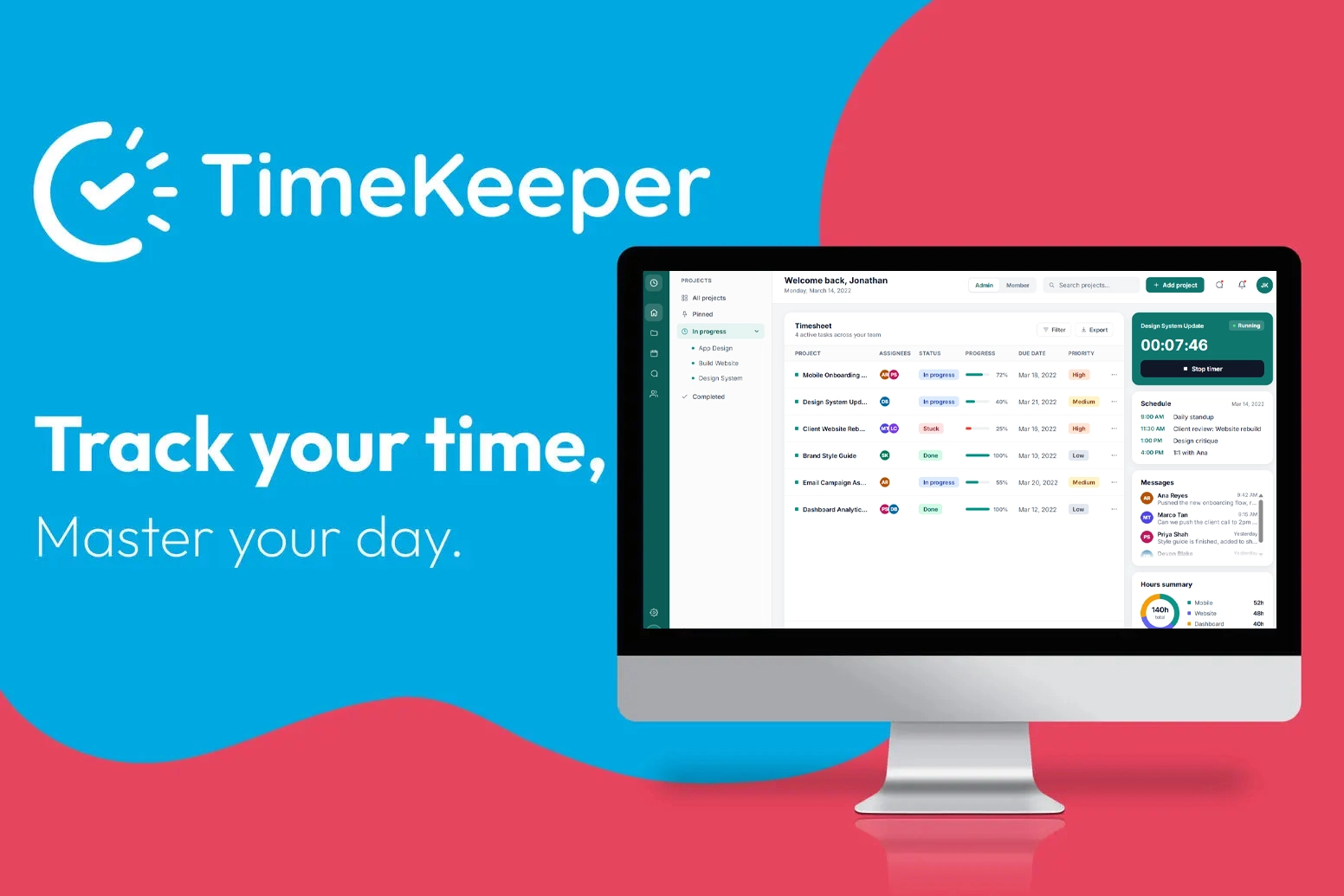
Teams lose hours to timesheets filled in from memory. Time Keeper makes tracking a one-click habit for the people doing the work, and gives the people managing it a clear view of the team — without it feeling like surveillance.
UsersJonathan, a creative director who manages the team · Ana, a designer who logs her own time
How the project came together
1
Research & design UX/UI
Research, competitive analysis, two personas, a user flow, and a clickable prototype tested one-on-one with 10 users.
2
Design review QA
Every screen reviewed for defects and accessibility before anything was built.
3
Documentation Technical Writing
Guides for both audiences — the admin who manages projects and the member who tracks time — plus reference topics and UX writing.
4
Build & test UX/UIQA
An interactive prototype that fixes what the review found, tested against 25 cases. Try it.
10
Users tested the early prototype
9
Defects found and fixed, 7 of them before build
11
Contrast failures fixed before build
25
Test cases run against the prototype
UX/UI
Research and design
Research & competitive analysis
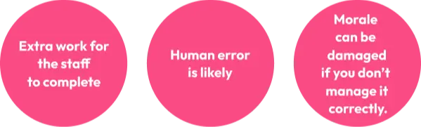
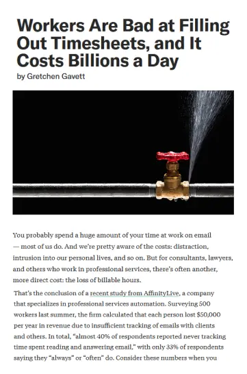
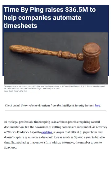
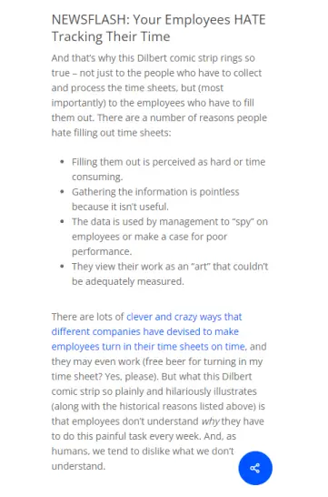
Time tracking is an industry people are actively investing in — and one most teams still get wrong. Manual timesheets create real, well-documented pain points.
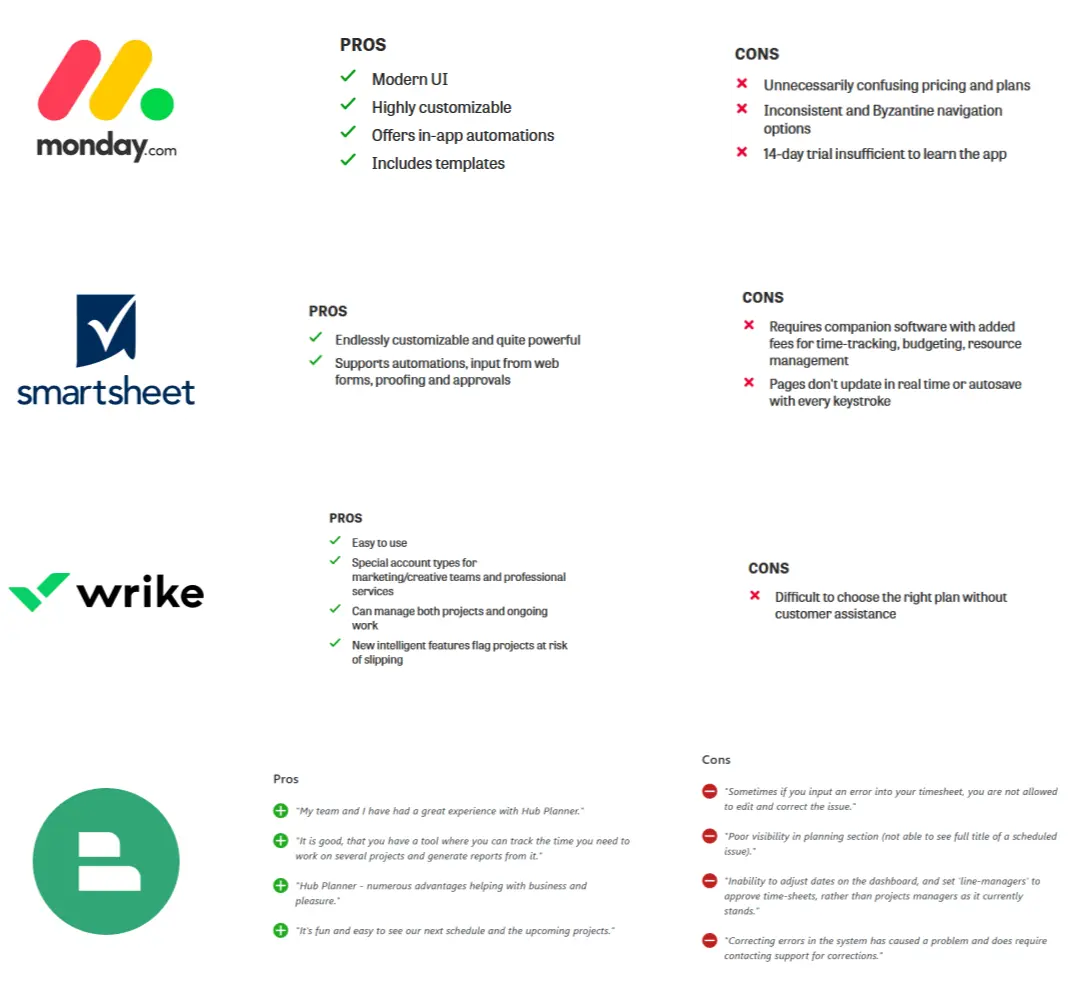
I compared four existing tools — monday.com, Smartsheet, Wrike and Hub Planner — to see where they held up and where they consistently frustrated users.
Personas
Two personas represented the two sides of the same tool: the person managing deadlines, and the person whose time is being tracked. They also became the two audiences of the documentation.
Jonathan, 37, Creative Director — needs visibility across his whole team's workload without micromanaging anyone.
Ana, 26, Graphic Designer — needs to log her time without it feeling like surveillance or eating into her actual work.
Design process
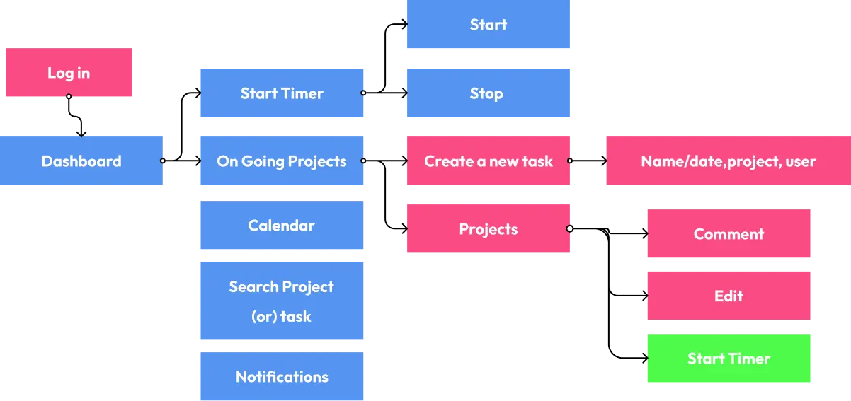
A user flow diagram mapped the primary interactions first — from login through starting a timer, managing projects, and getting notified.
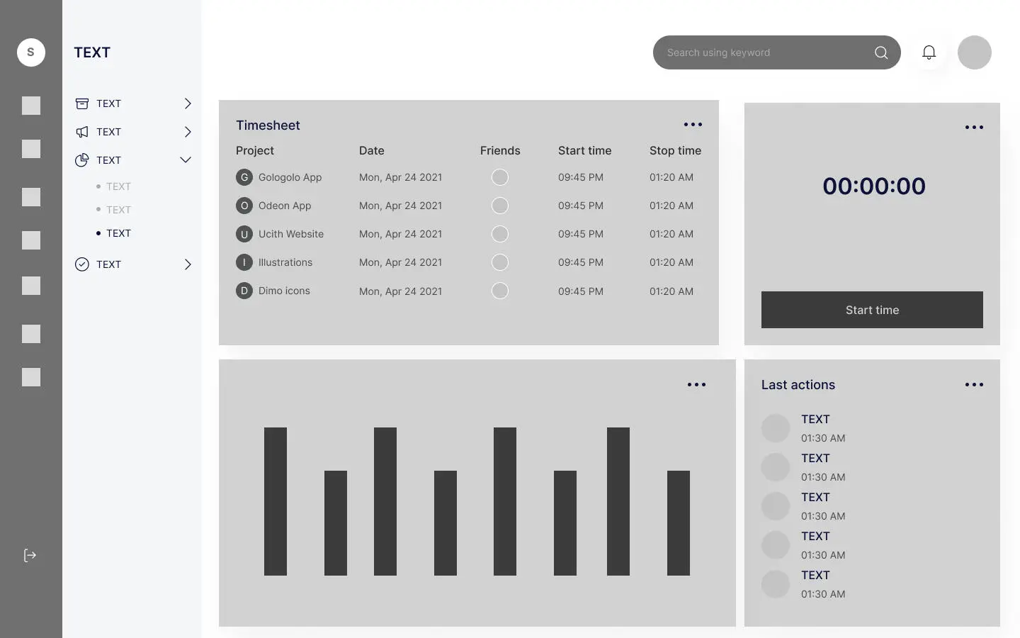
Low-fidelity wireframes locked in the dashboard layout before any visual design — timesheet table, live timer, and activity chart.
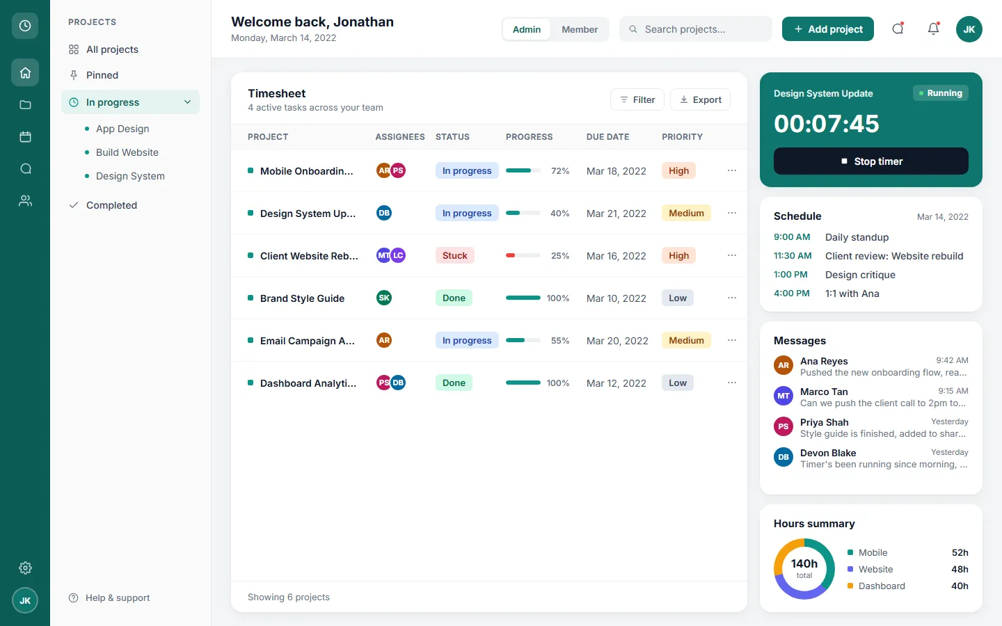
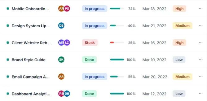
Then the high-fidelity design — a dashboard built around live time tracking and a timesheet the whole team shares, with the schedule and messages one glance away.
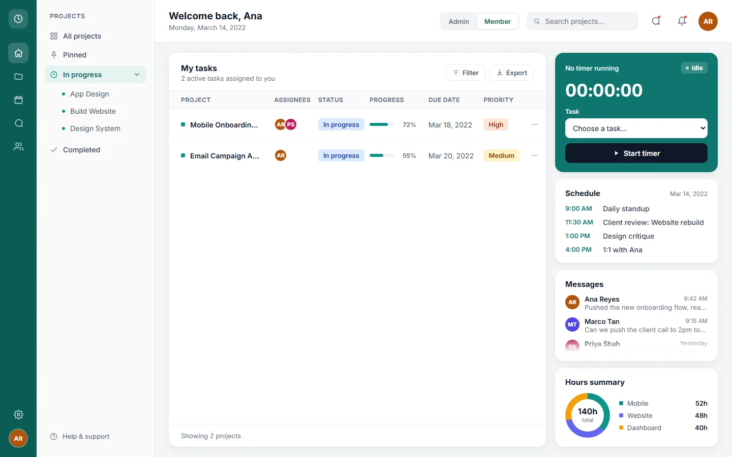
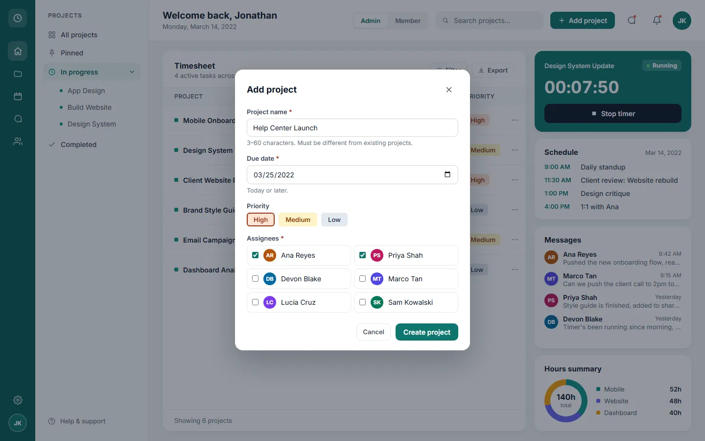
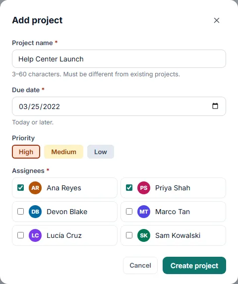
Admin view — Jonathan sees the whole team and is the only one who can create projects.Member view — Ana sees only her tasks, and her timer is hers alone.Add project — the one form in the product, with a hint and a validation rule for every field.
Design decisions
1
The timer lives on the dashboard
Starting to track takes one click from the screen people already open every morning. People guess their timesheets because logging is a chore — so the design removes the chore instead of adding reminders.
2
Status and priority side by side
Jonathan can spot what's at risk — stuck and high priority — without opening a single project.
3
Faces in every row
Team avatars make it obvious who is on what at a glance. That's the visibility Jonathan needs, without having to ask.
4
Work, not activity
No screenshots, no keystroke counts — the product only knows the time people choose to log. That's what keeps it on Ana's side.
5
The timer button says what it will do
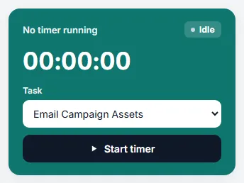
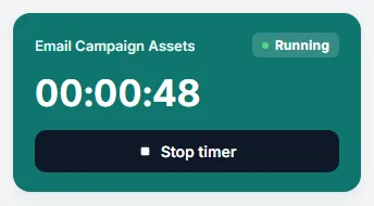
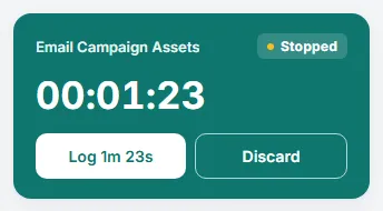
Three explicit states — Start timer, Stop timer, Log — so the label never contradicts the clock.
6
Priority is written, not starred
High, Medium and Low pills carry their meaning in the word itself. Stars need a legend nobody reads.
7
Two personas, two roles
Admins see the team and create projects; members see their own work. Each person has their own timer.
8
Accessible by default
Every text and control meets WCAG AA contrast — measured, not assumed.
Key features
The design leaned on simplicity and transparency — features built to keep both managers and individual contributors on top of deadlines without adding friction to the workday.
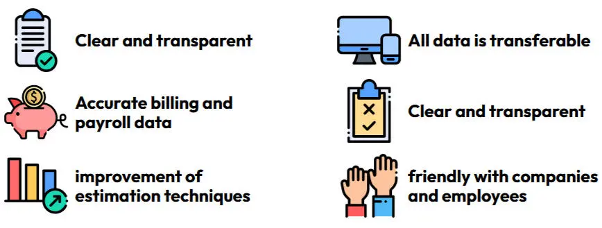
And the reason this matters — nobody actually likes filling out a timesheet honestly.
Validation
An early clickable prototype was tested one-on-one with 10 users to check that it stayed intuitive and useful for both personas.
Time Keeper has two kinds of readers with opposite needs: an admin who sets up work for a team, and a member who wants to log time and get back to it. The documentation is written for both — often in the same topic.
The samples below are excerpts. Each one opens with a short note on who it's for and why it's written the way it is.
Documentation plan
Audiences
Audience
Who
What they need from the docs
Admin
Jonathan, creative director
Set up projects and assign people, read the team's timesheet, spot risk early.
Member
Ana, graphic designer
Track time with as little friction as possible, understand what each status means, fix a timer mistake.
Topic map
Every topic has one job, and its type says which: concepts explain, tasks walk through an action, references are looked up, troubleshooting fixes a problem.
On a team, this is where I'd interview the product manager for intent, engineering for edge cases and QA for known issues. Here, every step was performed in the working prototype and every rule matches what the product actually enforces — the documentation and the test cases were written from the same source.
Sample 1 · One topic, two audiences
Audience
Admin and member
Type
Concept · onboarding
Why it's written this way
One source, two outputs. Admins and members need different things from the same first page, so the topic carries both and each reader sees only theirs. In MadCap Flare this is one topic with two condition tags; the switch below applies them live.
Show this topic for
Time Keeper Help › Get started
Get started with Time Keeper
Time Keeper tracks the time your team spends on projects. You record time with a timer, and Time Keeper adds it to the project.
Your dashboard
Timesheet — projects with their assignees, status, progress, due date and priority.
Time tracking — your timer.
Schedule and Messages — today's meetings and the latest notes from your team.
Hours summary — total hours logged, split by area.
Admin
What you can do as an admin
Create projects and assign people to them.
See every project and every assignee in the Timesheet.
Track time on any active project, including ones you aren't assigned to.
This is the action members repeat every day, so it has to be scannable in five seconds: one action per step, the result right after it, and a picture of every state the timer can be in.
Time Keeper Help › Tracking time
Track time on a task
Use the timer to record how long you work on a task. You can track time on any active task assigned to you.
In the Time tracking card, open the Task list and choose a task.
Select Start timer. The status changes to Running and the clock starts.
When you finish, select Stop timer. The clock stops and the status changes to Stopped.
Select Log to add the time to the task. A confirmation appears in the lower-right corner, and the timer returns to Idle.
Note Your timer belongs to you. Nobody else can start or stop it, and it keeps running if you look at another part of Time Keeper.
This is the only form in the product. Every rule it enforces is documented before anyone hits it, and every error message in the table is the exact text the product shows — so people can search for the message they got.
Time Keeper Help › Managing projects
Create a project
Create a project to give your team something to track time against.
Before you start Only admins can create projects. If you don't see Add project on the top bar, you're viewing Time Keeper as a member.
On the top bar, select Add project.
Enter a Project name, choose a Due date and a Priority, and select at least one person under Assignees.
Select Create project.
Result: The project appears at the top of the Timesheet with the status Not started. Everyone you assigned sees it under My tasks.
Field rules
Field
Required
Rule
Message if it isn't met
Project name
Yes
3–60 characters. Must be different from every existing project name — capitalization and extra spaces don't make a name different.
Enter a project name. Use at least 3 characters. Use 60 characters or fewer. A project with this name already exists.
Due date
Yes
Today or later.
Choose a due date. The due date can’t be in the past.
Priority
No
High, Medium or Low. New projects start at Medium.
—
Assignees
Yes
At least one person.
Assign at least one person.
Sample 4 · Reference
Audience
Admin and member
Type
Reference
Why it's written this way
Definitions are looked up, not read. So they're tables with one definition per row, and permissions are written as words, not check marks, so they read the same to a screen reader.
Time Keeper Help › Reference
Statuses, priorities and roles
Project statuses
Status
What it means
Not started
The project exists, but work hasn't begun. New projects start here.
In progress
Work is underway.
Stuck
Work is blocked. Its progress bar turns red so it stands out in the timesheet.
Done
The project is finished. Done projects no longer appear in the timer's Task list.
Priorities
Priority
When to use it
High
Do it first. Missing the due date affects a client or another project.
Medium
Normal work. The default for new projects.
Low
Do it when higher priorities allow.
What each role can do
Action
Admin
Member
See projects in the timesheet
All projects
Only projects they're assigned to
Create projects
Yes
No
Track time
On any active project
On their own active tasks
Have their own timer
Yes
Yes
Sample 5 · Troubleshooting
Audience
Admin and member
Type
Troubleshooting
Why it's written this way
It starts from a real message in the product — “Timer's been running since morning, is that right?” Each problem is written the way a person would describe it, so it matches what they search for. It also documents a limit honestly: logged time can't be edited.
Time Keeper Help › Troubleshooting
Fix common timer problems
The timer has been running for hours
Why it happens: The timer keeps running until you stop it, even after you move on to other work.
What to do:
Select Stop timer.
If the time is wrong, select Discard, and then Confirm discard. If it's right, select Log.
Important You can't edit time after you log it, so check the clock before you select Log.
“Choose a task first.” appears when I select Start timer
Why it happens: No task is chosen in the Task list.
What to do: Choose a task, and then select Start timer again.
My task isn't in the Task list
Why it happens: The task is Done, or — if you're a member — you aren't assigned to it.
What to do: Ask an admin to assign you to the project. Done projects can't be timed.
I can't find Add project
Why it happens: Only admins can create projects.
What to do: Ask an admin to create it and assign you.
UX writing: before and after
Documentation starts in the interface. These labels changed between an early draft and the final design — each change is one less thing the help center has to explain.
Where
Early draft
Final
Why
Timer, while running
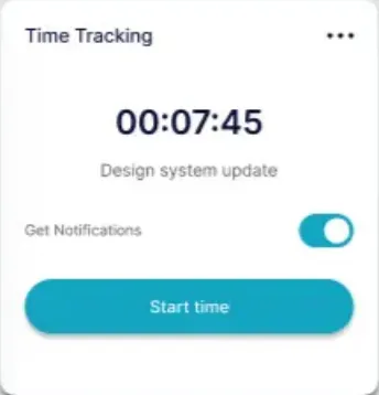
Start time
Stop timer
A button should say what it will do. “Start” on a running clock said the opposite.
Timer, idle
Start time
Start timer
Time is what you track; the timer is what you operate.
Timesheet columns
Timeline · Timeline
Progress · Due date
Two columns with one name made people guess. Each name now says what the column holds.
Status
Working on it
In progress
A status, not a sentence — and short enough to scan down a column.
Priority
★★★☆☆
High · Medium · Low
Stars had no defined scale. A word carries its own meaning.
Timesheet subtitle
6 active tasks
4 active tasks
The count included finished work. A number in the interface has to be true.
How the error messages are written
Say what to do, not what went wrong — “Choose a due date.”, not “Invalid date.”
One sentence, no blame — never “You entered…”.
Use the field's own words, so the message and the label point at the same thing.
Show the message next to its field, and move focus to the first one that needs attention.
Style conventions
The samples follow the Microsoft Writing Style Guide:
Second person, present tense, active voice.
Select instead of “click”, so the steps work for mouse, touch and keyboard.
Interface labels in bold, spelled exactly as they appear on screen.
One action per step, with the result right after it.
Sentence-case headings, and no “please”.
QA
Review and testing
Time Keeper was reviewed three times: the design before anything was built, the accessibility of every screen, and the working prototype against 25 test cases.
Testing your own design is the hardest kind of testing to do honestly. Almost every defect below is in the project's own work — the early design, the mock and the prototype's code — and each one is fixed and retested.
Test plan
Objective
Make sure both roles can track time and manage projects correctly, and that every screen works with a keyboard and meets WCAG AA — before and after the build.
Scope
In scope
The timer, in every state
Admin and Member roles and their permissions
Project search
The Add project form and its validation
Accessibility of every screen
Out of scope
Filter, Export, messages and calendar — not built in the prototype
Browsers other than Chrome
Phone layouts — the product targets desktop
Performance and load — the prototype has no backend
Approach
Pass
What was reviewed
How
1 · Design review
The early-iteration screens and the design mock
Heuristic review against each persona's tasks; consistency and content checks
2 · Accessibility audit
The mock and the prototype
Contrast measured with the WCAG 2.1 formula, an axe-core scan of four states, keyboard and focus checks
3 · Functional testing
The interactive prototype
25 test cases: equivalence partitioning, boundary values, state transitions, negative and role-based tests
High The timer records the wrong time or the wrong task
Time data feeds billing and payroll — it's the product's core promise
TC01–TC08, TC12
High A member sees or does what only admins should
A permission leak is a trust problem
TC09–TC11, TC22
Medium The form accepts bad data
Duplicates and past dates pollute the timesheet
TC15–TC20, TC23
Medium A screen can't be used with a keyboard or low vision
Accessibility is a requirement, not a feature
Contrast audit, axe-core, TC15, TC21, TC25
Low Search gives no feedback when nothing matches
Minor friction
TC13
Exit criteria
Every High-risk case passes, no High-severity defect stays open, and axe-core reports zero violations. All three were met.
Defects found — 9, all fixed
Each report says where it was found, what was expected, what actually happened, and how it was fixed and verified.
D-01 · [Timer] The button reads "Start time" while the timer is running
Found in: design review · early iteration
Severity: HighPriority: HighFixed
Open the dashboard while a timer is running.
Read the button in the Time Tracking card.
ExpectedThe button offers the next action: stop the timer.
ActualThe clock shows 00:07:45 and the button says "Start time".
Early iterationFixed
Fix: Three explicit states — Idle, Running, Stopped — and a button that always names the next action. Verified by TC01–TC03 and TC06.
D-02 · [Timesheet] Two columns are both called "Timeline"
Found in: design review · early iteration
Severity: MediumPriority: MediumFixed
ExpectedEvery column has a unique name that says what it holds.
ActualThe progress bar and the date columns are both labeled "Timeline".
Early iterationFixed
Fix: The columns are now "Progress" and "Due date".
D-03 · [Dashboard] The header date and the schedule disagree
Found in: design review · early iteration
Severity: MediumPriority: LowFixed
ExpectedThe dashboard shows one "today", and today's meetings match it.
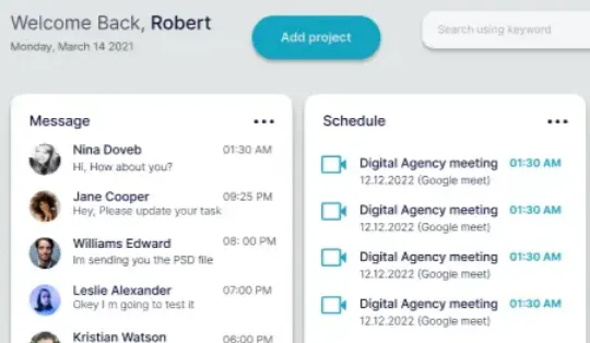
ActualThe header says Monday, March 14, 2021; every meeting in Schedule is dated 12.12.2022.
Early iteration
Fix: Every date on the dashboard comes from the same "today"; the header and the schedule now agree.
D-04 · [Timesheet] The same five rows repeat three times
Found in: design review · early iteration
Severity: LowPriority: MediumFixed
ExpectedEach row is a different project.
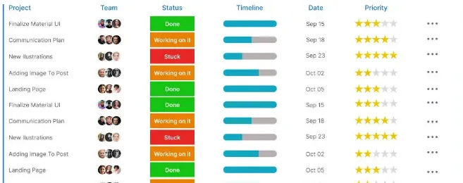
Actual"Finalize Material UI" to "Landing Page" repeat down the table, which makes the data look fake.
Early iterationFixed
Fix: Six distinct tasks, each with its own assignees, status and dates.
D-05 · [Timesheet] Priority stars have no defined scale
Found in: design review · early iteration
Severity: MediumPriority: MediumFixed
ExpectedAnyone can tell which projects are most urgent without a legend.
ActualTwo to five stars, with nothing saying whether five stars means most urgent or least. Visible in the early screens above.
Fix: Labeled pills — High, Medium, Low — shown in the fixed timesheet above and defined in the reference topic.
D-06 · [Accessibility] 11 text and control colors fail WCAG AA in the design mock
Found in: accessibility audit · design mock
Severity: HighPriority: HighFixed
ExpectedText and controls reach at least 4.5:1 contrast. The design brief required it in writing.
ActualSecondary text, table headers, the main button and avatar initials measure between 2.15:1 and 3.74:1.
Fix: Darker color tokens; every pair now measures 4.8:1 or more. Full numbers in the contrast audit. Requiring something isn't the same as verifying it.
D-07 · [Timesheet] The subtitle counts finished work as active
Found in: design review · design mock
Severity: LowPriority: MediumFixed
Expected"4 active tasks" — two of the six are Done.
Actual"6 active tasks across your team."
Fix: The count is computed from each task's status, so it stays true when projects are added. Verified by TC10 and TC20.
D-08 · [Add project] Focus doesn't return to "Add project" after the dialog closes
Found in: functional testing · prototype · TC21 failed on its first run
Severity: MediumPriority: HighFixed
Start a timer, then select Add project.
Create a project, or select Cancel.
Check which element has keyboard focus.
ExpectedFocus returns to "Add project", the button that opened the dialog.
ActualFocus lands on the timer's "Stop timer" button. A keyboard user loses their place.
Cause and fix: The code restored focus in the dialog's close event, which fires after the browser has already moved focus elsewhere — and Safari doesn't focus a button on click at all. Focus is now restored immediately on close, and on Esc. Verified by TC21 and TC25.
D-09 · [Accessibility] axe-core reports 3 violations in the prototype
Found in: accessibility audit · prototype
Severity: MediumPriority: MediumFixed
ExpectedZero violations in every state.
ActualThe "Running" label fails contrast on its translucent background, the demo bar sits outside any landmark, and the scrollable messages list can't be reached with a keyboard.
Fix: A solid label background, the demo bar marked up as navigation, and a keyboard-focusable messages list. A re-scan reports zero violations.
Accessibility audit
Contrast, measured
Every ratio is calculated with the WCAG 2.1 formula from the actual color values — not eyeballed. AA requires 4.5:1 for normal text.
Element
Mock
Prototype
Date under the greeting, card subtitles
3.07:1
4.97:1
Progress percentages
3.07:1
4.97:1
Table headers
2.48:1
4.80:1
"Help & support"
2.48:1
4.80:1
Message times
2.58:1
4.97:1
"Add project" button
3.74:1
5.47:1
Avatar initials (4 colors)
2.15–3.53:1
5.02–6.29:1
Automated scan (axe-core)
State
Before fixes
After fixes
Dashboard — Admin view
2 violations
0
Dashboard — Member view
3 violations
0
Add project dialog
0
0
Add project dialog, with errors
0
0
This case study page
—
0
Keyboard and focus
Every action is a native button, input or list — nothing is a clickable div.
Every control shows a visible focus ring.
The dialog moves focus to its first field (TC15), closes with Esc (TC25) and returns focus to the button that opened it (TC21).
Form errors move focus to the first field that needs attention (TC16).
When the timer changes state, focus moves to the next action, so the keyboard never ends up on a hidden button (TC02).
Test cases — 25 run, 25 passed
25
Test cases executed
25
Passed
1
Defect found during execution — fixed and retested
0
axe-core violations after fixes
Timer 8 cases
ID
Test
Technique
Expected result
Result
TC01
Admin's timer on load
State transition
Shows Running, 00:07:45 and a "Stop timer" button
Pass
TC02
Stop the timer
State transition
The clock freezes; "Log 7m 45s" appears and receives focus
Pass
TC03
Log the time
State transition
Confirmation "Logged … to Design System Update."; clock resets to 00:00:00
Pass
TC04
Start with no task chosen
Negative
"Choose a task first." appears; the timer stays Idle
Pass
TC05
Choose a task after the error
Negative
The error disappears as soon as a task is chosen
Pass
TC06
Start on a chosen task
State transition
The task name shows and the clock counts up
Pass
TC07
Discard the time
Negative
The first select asks "Confirm discard"; the second discards and resets
Pass
TC08
Which tasks can be timed
Equivalence partitioning
The 4 active tasks are listed; Done tasks are not
Pass
Roles and permissions 5 cases
ID
Test
Technique
Expected result
Result
TC09
Switch to the Member view
Role-based
The greeting says Ana; "Add project" is hidden
Pass
TC10
Member's timesheet
Role-based
Only her 2 tasks; "2 active tasks assigned to you"
Pass
TC11
Member's timer
Role-based
Ana's timer is Idle and lists only her 2 tasks
Pass
TC12
Switch back to Admin
State transition
Jonathan's timer is still running
Pass
TC22
New project assigned to Ana
Role-based
It appears in her view and in her timer's task list
Pass
Add project form 7 cases
ID
Test
Technique
Expected result
Result
TC15
Open the dialog
Accessibility
The dialog is modal and focus is in Project name
Pass
TC16
Submit an empty form
Negative
Three errors; focus moves to Project name
Pass
TC17
Project name length
Boundary values
2 characters ✗, 61 ✗, 60 ✓
Pass
TC18
Duplicate name
Equivalence partitioning
" BRAND style guide " is rejected as a duplicate
Pass
TC19
Due date
Boundary values
Yesterday ✗, today ✓
Pass
TC20
Create a valid project
Positive
It appears at the top as Not started, High; the count becomes 5 active
Pass
TC23
Cancel
Negative
The dialog closes and nothing is created
Pass
Focus, search and display 5 cases
ID
Test
Technique
Expected result
Result
TC21
Focus after the dialog closes
Accessibility
Focus returns to "Add project"
Pass Failed first run → D-08
TC25
Close the dialog with Esc
Accessibility
The dialog closes and focus returns to "Add project"
Pass
TC13
Search projects
Equivalence partitioning
"brand" → 1 row; "zzz" → "No projects match"; only spaces → all rows
Pass
TC14
Due dates and time zones
Boundary values
Shows "Mar 18, 2022" — not shifted to Mar 17 in the Americas
Pass
TC24
Controls outside the demo
Usability
They say "That control isn't part of this demo" instead of doing nothing
Pass
Traceability
Every requirement maps to the tests that check it and the defects that broke it. This is where the design, the documentation and the testing meet.
Requirement
Tests
Defects
Status
The timer button always names the next action
TC01–TC03, TC06
D-01
Fixed
Only active tasks can be timed; members only their own
TC08, TC11, TC22
—
Met
Members can't create projects or see other people's tasks
TC09, TC10
—
Met
Each person has their own timer
TC11, TC12
—
Met
Project names are unique and 3–60 characters
TC16–TC18
—
Met
Due dates can't be in the past
TC19
—
Met
Column names are unique and descriptive
Design review
D-02
Fixed
Priority is readable without a legend
Design review
D-05
Fixed
Every number, date and row shown is true
TC10, TC14, TC20
D-03, D-04, D-07
Fixed
Every screen meets WCAG AA and never loses keyboard focus
Contrast audit, axe-core, TC15, TC21, TC25
D-06, D-08, D-09
Fixed
Decision log
1
Review the design before building it
A defect found in a mock costs a text edit; the same defect found in production costs a release. Seven of the nine defects were caught before a single line of code.
2
Pick the technique that matches the shape of the feature
The form has hard limits, so boundary values. The timer is a state machine, so state transitions. Roles are classes of users, so equivalence partitioning by role.
3
Spend the most time on the two High risks
Wrong time data and leaked permissions would break trust in the product, so they got 13 of the 25 cases.
4
What wasn't tested — and what's next
A full screen-reader pass with NVDA and VoiceOver: accessible names and roles are covered by axe-core, but a manual pass is next. Firefox and Safari: D-08 is a reminder that browsers differ, so a cross-browser run comes next. After that, automate the 25 cases so they run on every change.